
This guide is here to help you get to know Studio and best utilize its features. At the bottom, you’ll find guides on how to install custom colorpacks and parts packs to extend your usage – you can download them at this link.
Step 1: Install Bricklink Studio
Go to https://www.bricklink.com/v3/studio/download.page. Click “Download Studio for Windows” or “Download Studio for Mac”.
Installing Studio on Windows: Run “Studio+2.0.exe”. Agree to the license agreement, click through the setup wizard, wait for the install, and then restart your computer.
Installing Studio on MacOS: Open “Studio+2.0.pkg”, click through the install wizard
Step 2: Run Studio for the first time
Now that you’ve installed Studio, it’s time to use it. Run it and let it load. Eventually you’ll reach the welcome screen. If you have a BrickLink account, you can use the “Sign in” button at the top right to log into your account. This can let you directly export your Studio builds to your BrickLink account as a wantlist. You may occasionally be signed out due to errors on BrickLink’s end.
When you’re ready, click “Create new” to start your first file.
Step 3: Using Studio
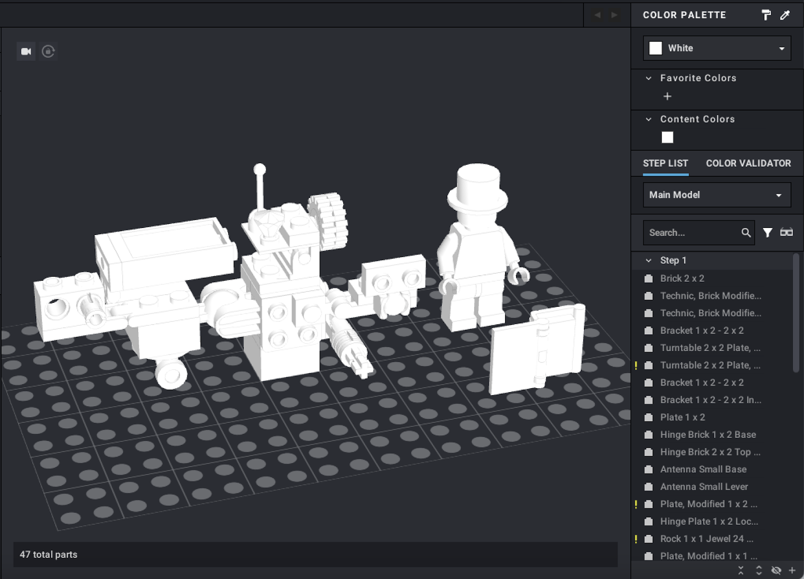
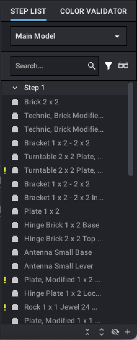
This is the viewport. By right-clicking and dragging with your mouse, you can rotate the camera. By middle-clicking and dragging with your mouse, you can pan the camera. You can also pan the camera using the W, S, A, and D keys. If you get your camera into an uncomfortable position, you can right click anywhere in the viewpoint and select “Reset camera origin” to reset its pan and zoom. Reset camera origin will attempt to frame all parts in the viewport. Additionally, if you have a part in the viewport you’d like to focus on, you can right-click it and select “Pan to cursor” to center the viewport on it.
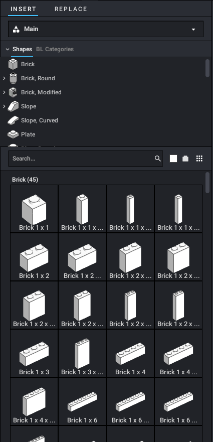
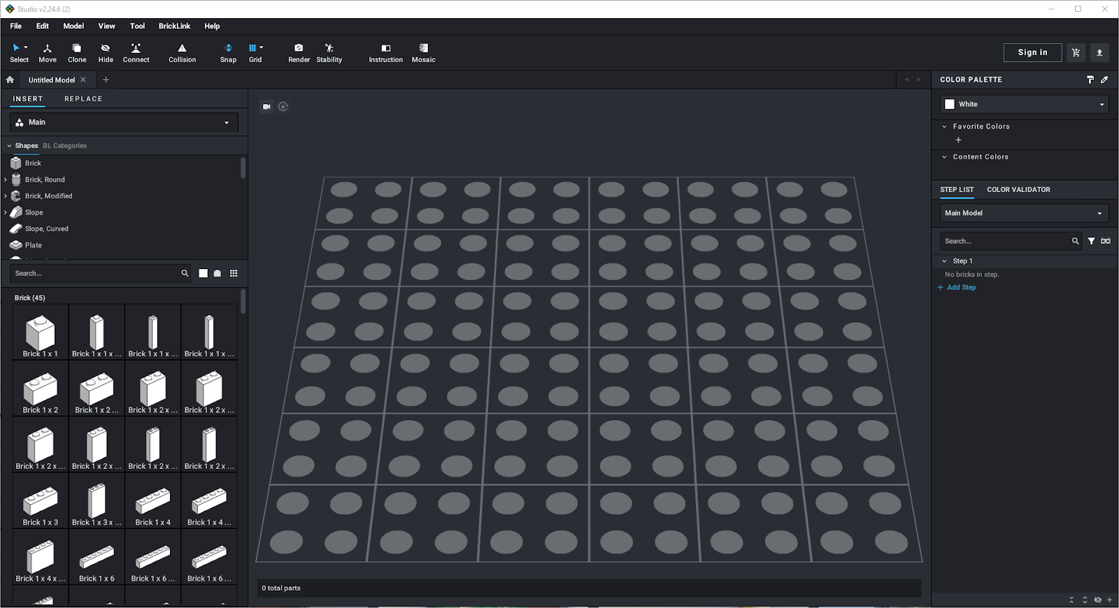
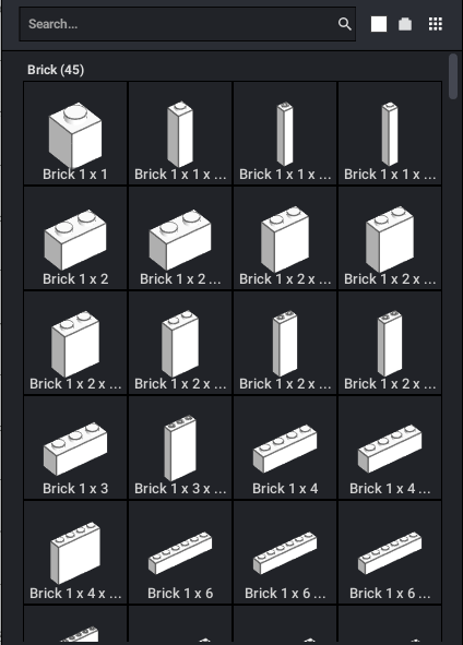
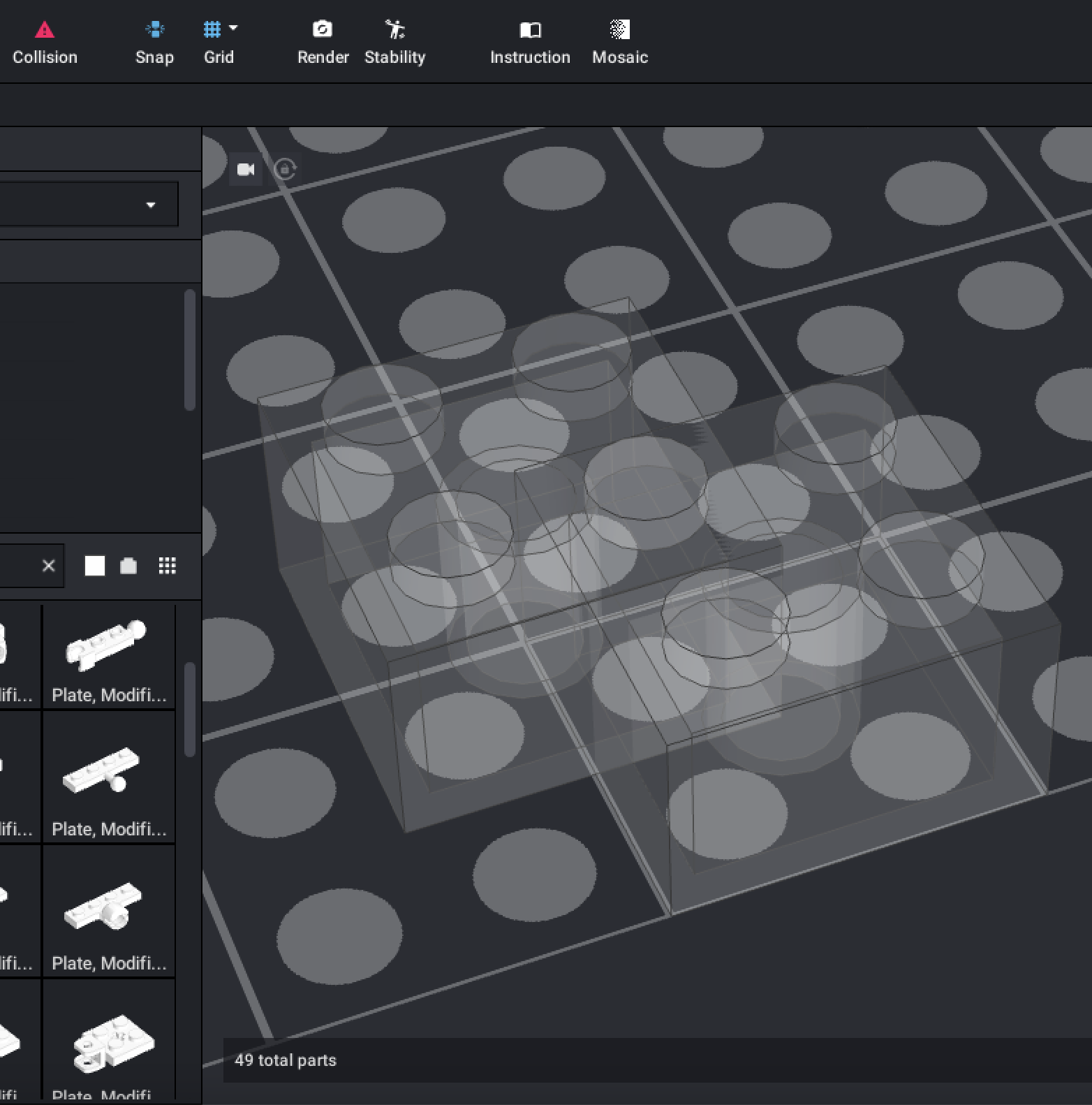
Every Studio part can be found in the palette. Using the search bar, you can type in the name or ID number of a part (if you know it) to find a part easily. When clicking a category in the category selector, the parts palette will jump to the chosen category.
To place a part in a build, click it, then move your cursor to the viewport. To place it, click again where you want it to be. After you’ve placed a part with left click, you can right click to clear your cursor. While you have a part on your cursor, you can rotate it 90 degrees with the arrow keys. You can rotate any selection at any time using the arrow keys. To rotate in smaller increments of 45 degrees, hold the Shift key while pressing the arrow keys.
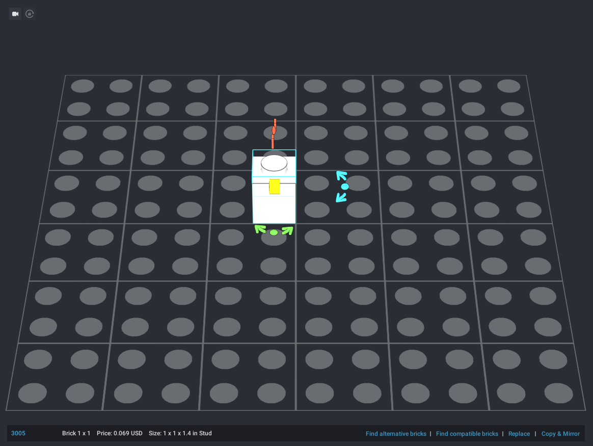
The bottom of the viewport displays information on your selection. Because I have one part selected, it tells me the part ID number, its name, average price for the color, and its size in studs. Clicking on the part’s ID number will open the part’s BrickLink page in a browser.
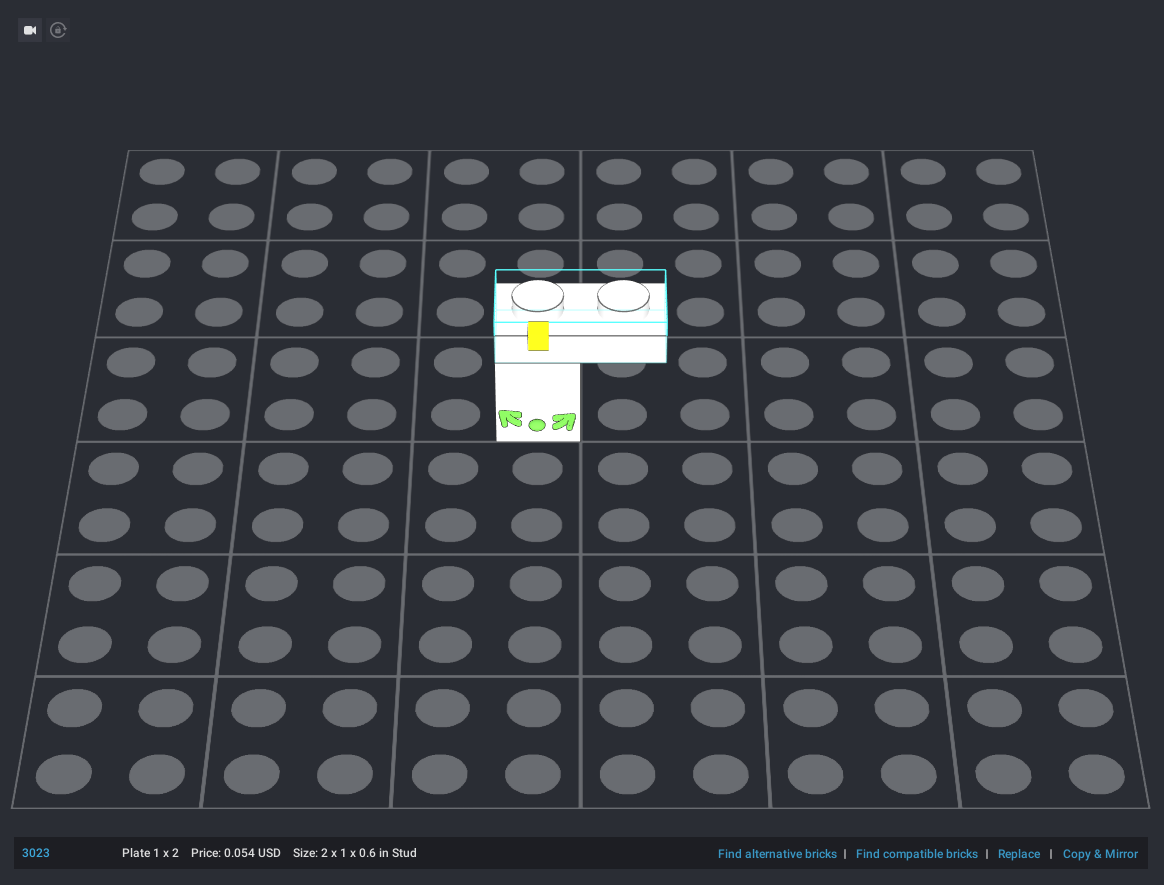
When placing multiple parts, parts that can connect will automatically snap together. If I place a plate on top of this brick, the plate will snap into place.
Most other types of connections will also automatically snap into place, including some bespoke connections like tires onto wheel hubs, and windows and doors into their frames.
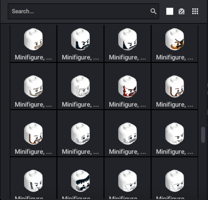
Next to the parts search bar, you can choose the default color for palette parts, and enable or disable decorated parts. This is the only way to use prints and stickers without PartDesigner, and prints cannot be applied on-the-fly – they must be baked into a part’s data.
Once you’ve placed a few parts, you can go to the color palette on the left side to color your pieces.
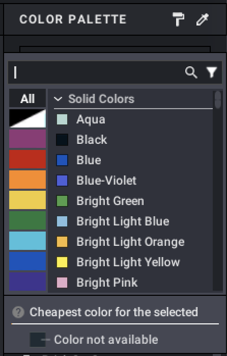
On the left side at the top is the color palette. Below it is the parts list.
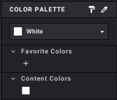
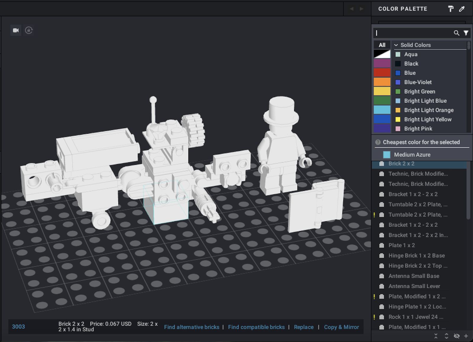
If you select a part, the color drop-down will display the cheapest available color it can be found in. In this example, the 2×2 brick (part number 3003) is cheapest in Medium Azure.
Beneath the drop-down menu is the Favorite Colors list, which you can add colors to using the “+” button. Favorite Colors will always appear on the palette so they are easily accessible.
Beneath the Favorite Colors list is the Content Colors list. Every color used in your model will appear in the Content Colors list.
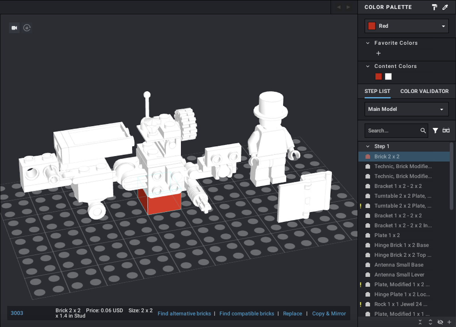
There are two main ways to color parts. One way is to select a part (by left-clicking it), then navigating to the color palette and choosing the color you want. This will instantly color the selected part with the color of your choice.
The other method is to open the drop-down, choose the color you want, and then click the paint roller button above the drop-down. This is the paint tool. While you are using the paint tool, whichever parts you left-click on will be colored using the color selected on the palette. You can quickly and easily color multiple parts using the paint tool. To change colors with the paint tool, click the roller, then choose a new color on the palette.
You can also use the eye dropper tool next to the paint roller to select a color. By clicking on the eye dropper icon and then any part on the model, you will automatically select that part’s color in the palette.
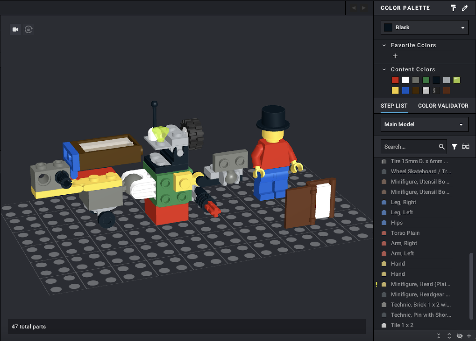
Here is a fully-colored version of my demonstration model. Note that there are a few color classes – aside from normal colors like Red or Blue, there are transparent colors (this model uses Trans-Clear and Trans-Neon Green), rubber colors (for rubber parts like tires), and pearl colors (for metallic parts), among others.
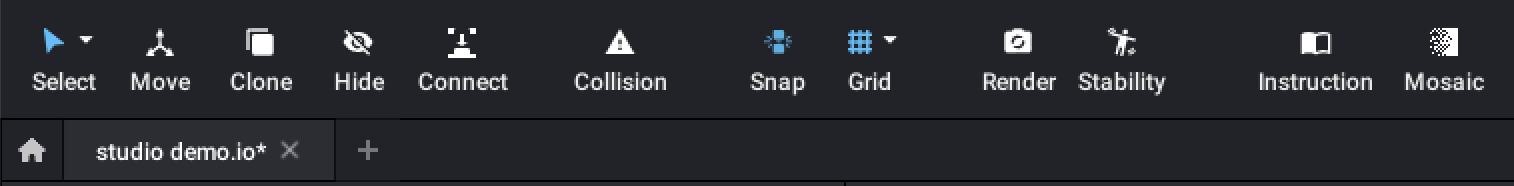
At the top of the screen, you’ll find a few more functions. The leftmost tool, the Select Tool, shows the different selection methods when its drop-down is clicked.
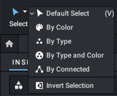
When using Select by Color, all parts that have the same color as the part you clicked will be selected.
When using Select by Type, all parts that are the same mold as the one you clicked will be selected.
When using Select by Type and Color, all parts that are both the same mold and same color as the one you clicked will be selected.
When using Select by Connected, all parts that are connected to the one you clicked will be selected.
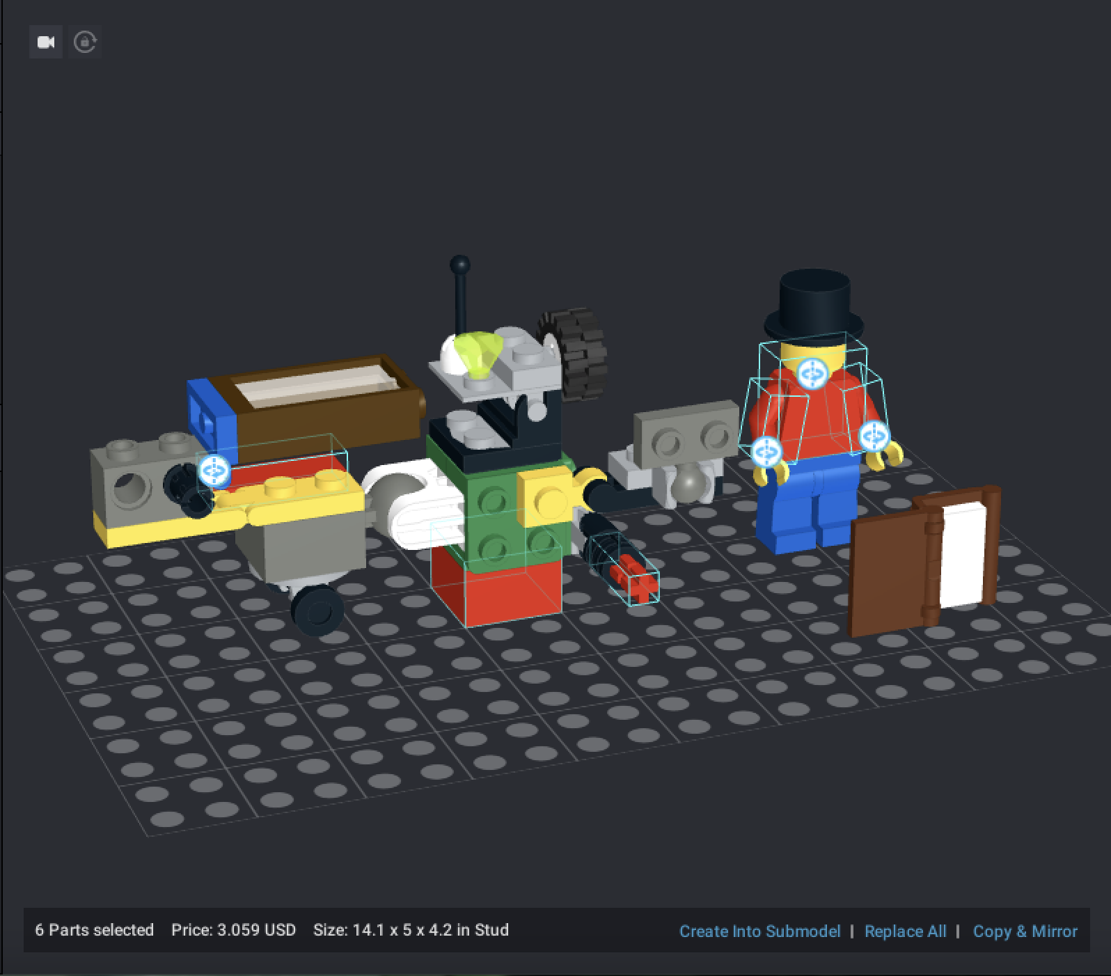
Using Select by Color, I clicked on the red 2×2 brick at the bottom of the model. All red parts in the model were selected.
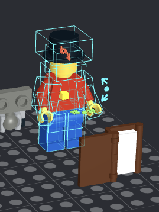
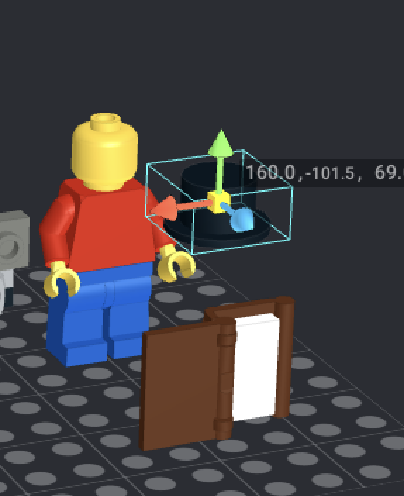
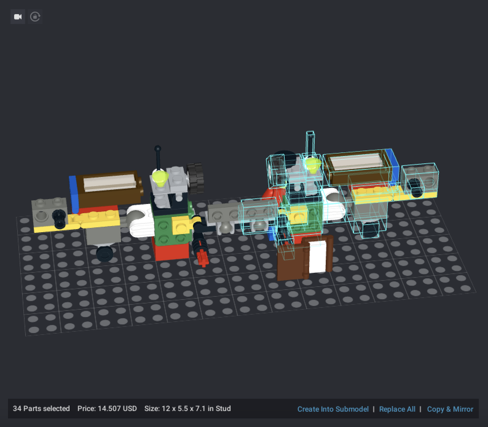
Using Select by Connected, I clicked on this minifigure’s top hat. All parts connected to the top hat were selected.
Once you’ve made a selection, the Invert Selection option will switch the selected state of all parts. If I click Invert Selection now, everything except the minifig will be selected.
Pressing V at any time will bring up the default selection tool. You can also drag your mouse over multiple parts to select them all at once. If you wish to select multiple disconnected parts, you can hold down CTRL (on Windows) or command (on MacOS) while clicking to add them to your selection.
The second tool on the toolbar, the Move Tool, will bring up a transformation gizmo on any part you select. Here, I’ve selected the minifigure’s top hat again.
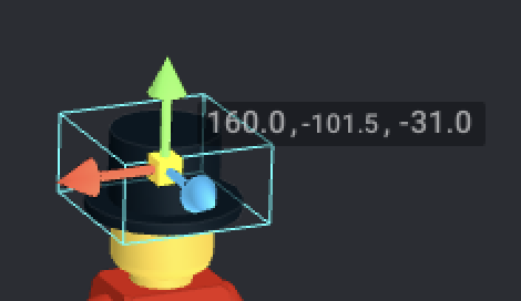
The Move Tool displays a part’s 3D coordinates. These coordinates can be clicked on and edited directly. By changing the top hat’s X coordinate from 160.0 to 170.0, I’ve moved it slightly to the right.
You can also move parts using the Move Tool’s transformation gizmo. By clicking and dragging any of the three arrows, you can move the part along the axis it represents.
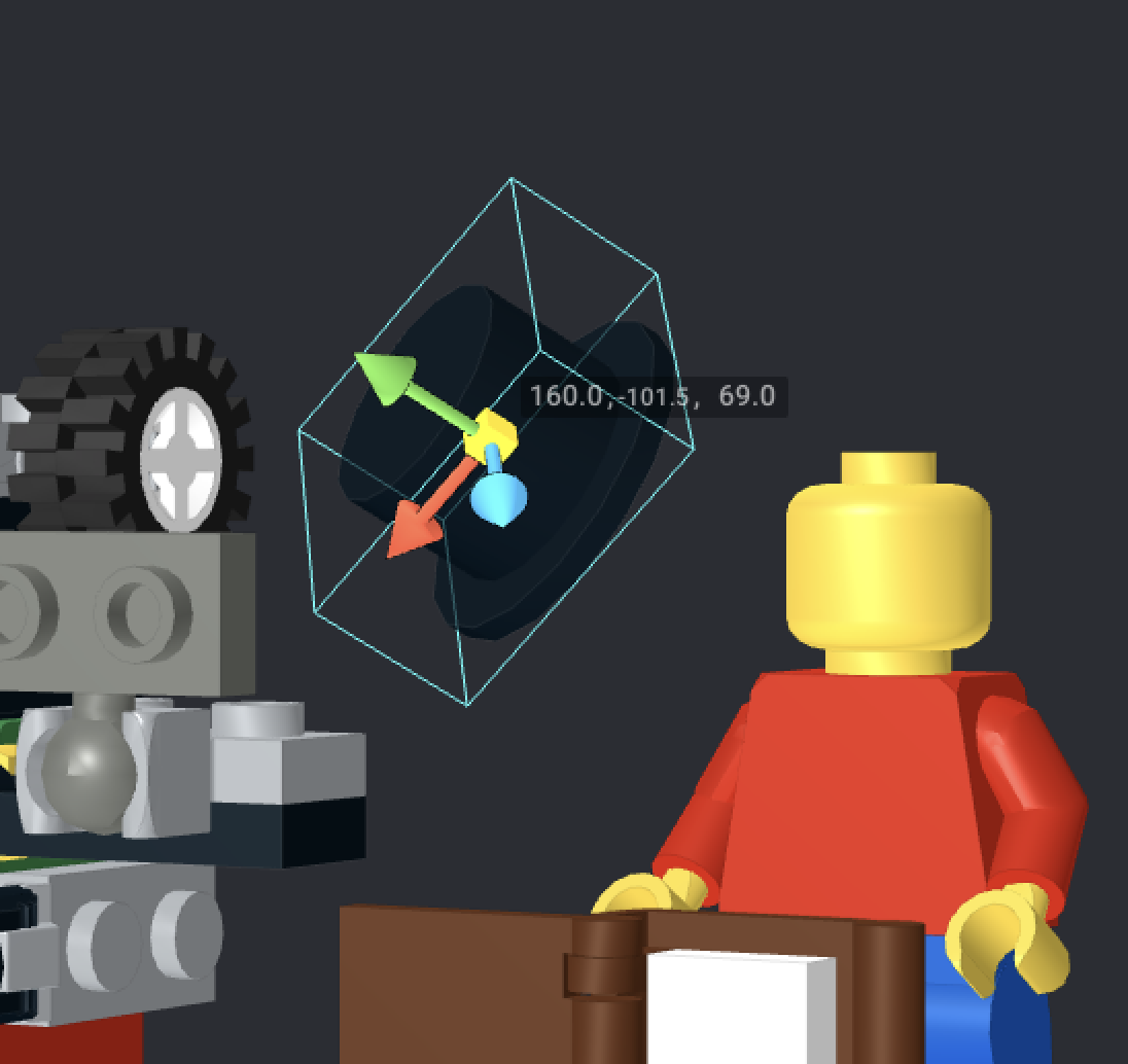
The Move Tool’s transformation gizmo will always align with a part’s local axes. If a part has been rotated (more on that later), the transformation gizmo will rotate with it. To align the transformation gizmo with the global axes rather than the part’s local axes, click the cube in the center.
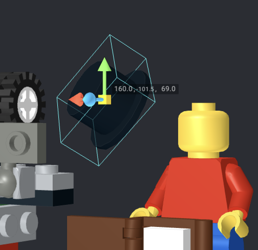
You can also move any selected part using the W, S, A, and D keys.
The Clone Tool will copy any part you click to the cursor, including its color. You can also select multiple parts and then click the Clone Tool, which will copy the entire selection rather than just one part at a time. You can call up the Clone Tool at any time with the hotkey C. CTRL+C and CTRL+V (Command+C and Command+V on MacOS) can also be used to copy and paste selections.
If you wish to copy and mirror a selection, you can select it, and then click “Copy & Mirror” in the bottom right of the viewport.
Result of clicking the red 2×2 brick with Select by Connected, then choosing Copy & Mirror
Some parts, usually custom parts, will not play nicely with Copy & Mirror. Left- or right-handed parts, such as wedge plates and slopes, may also experience issues.
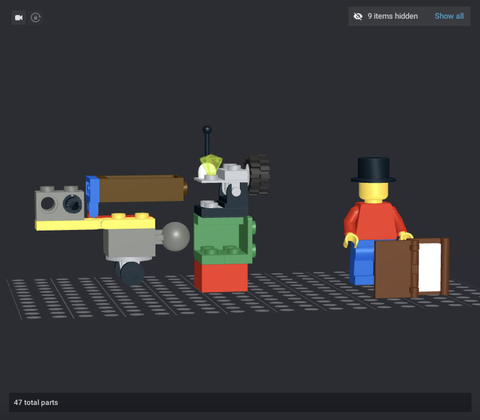
The Hide Tool can hide parts from view without deleting them from the model. This is useful for working on the inside of a complex model. When parts are hidden, a dialogue will appear in the top-right corner of the viewport saying how many parts are hidden. Clicking “Show all” will reveal all hidden parts.
The Connect Tool can be used to snap two parts together. Generally, the tool is more hassle than it’s worth to use, especially with Technic parts.
The Collision Tool is a toggle. When it is active (indicated by the icon turning red), parts that are colliding with one another will turn transparent. While the Collision Tool is active, hinge movements will attempt to avoid colliding.
The Snap Tool is a toggle that causes parts to automatically snap together when placed near one another. It turns blue when active.
The Grid Tool controls how coarse or fine the movements of the Move Tool are. By default, the grid size is medium; you can also choose a coarser grid or a finer grid, or, for the medium grid, change the height step to plate-height.
Step 4: Posing your model
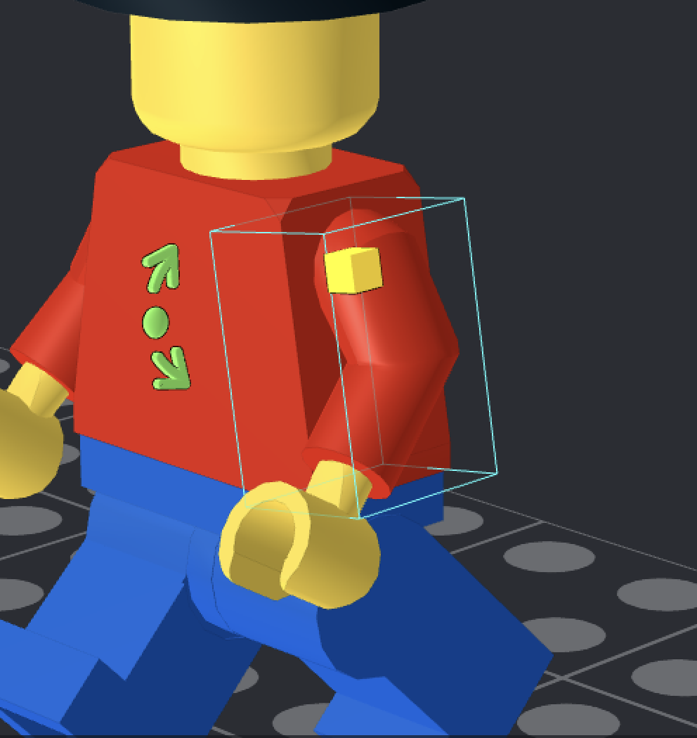
Before you render your model, it’s best to put it in a pose. Posing can be done with the Move Tool and the context-sensitive Hinge Tool. As you’ve probably noticed in some of these screenshots, selecting parts will bring up a rotation gizmo, like so:
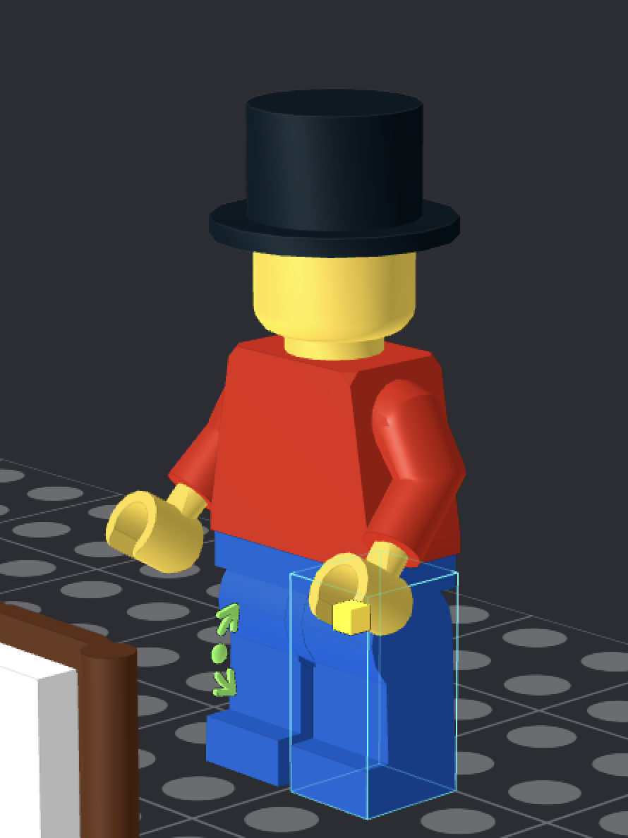
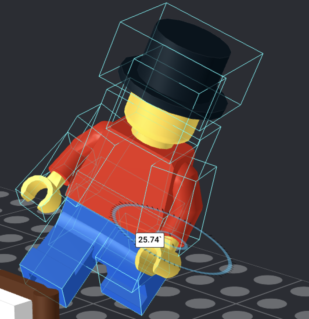
To rotate this minifigure’s leg, I can simply select it, then drag the arrow on the rotation gizmo until it ends up where I want it. To instantly rotate a part 90 degrees, you can click the arrow once.
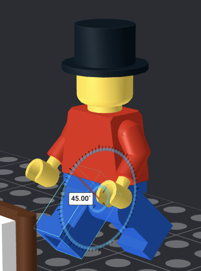
You can also click the circle in the center of the rotation gizmo to show the rotation value (in degrees). Similar to the coordinates the Move Tool shows, you can click and edit the value directly.
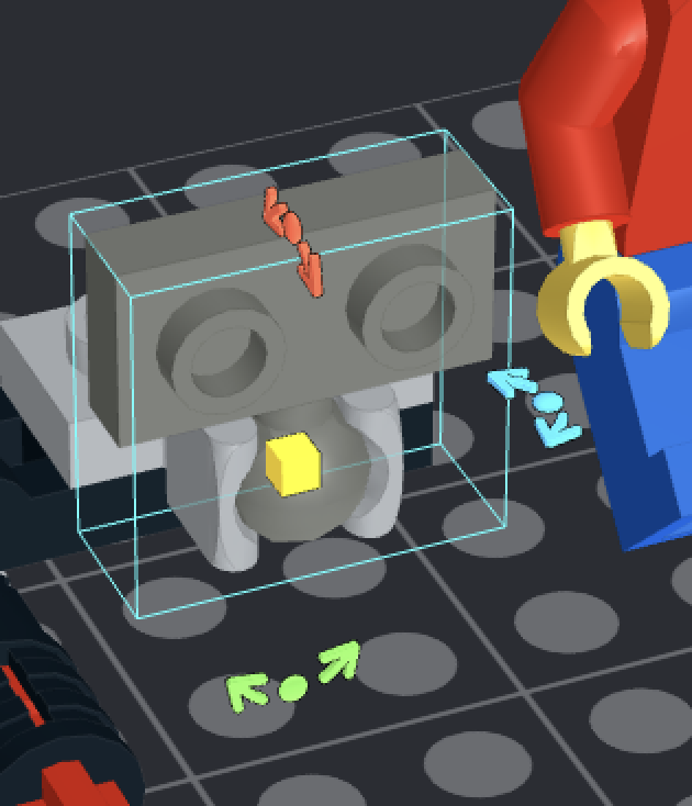
Certain connections, such as ball joints, may rotate on multiple axes. If this is an option, multiple rotation gizmos will appear.
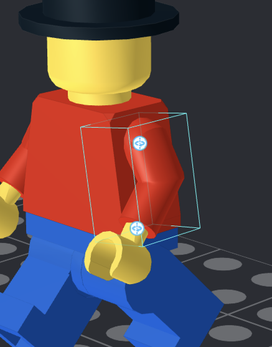
If you select a part that has multiple points around which it can rotate, then buttons will appear on the part to select where it will rotate. Be sure to pay attention which button you press, because rotating the wrong one will rotate large swaths of a model. See below:
Step 4a: Submodels
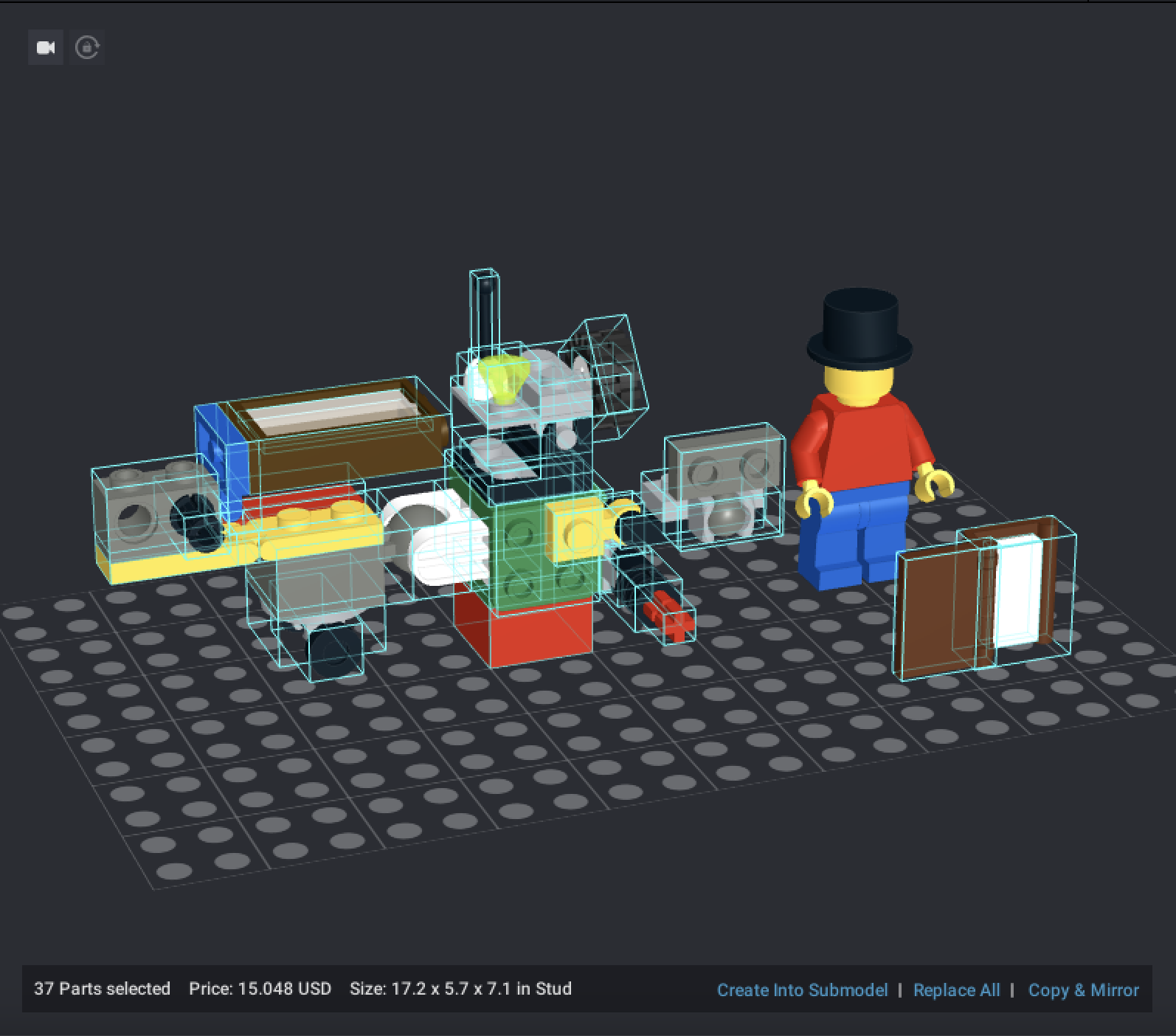
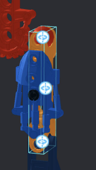
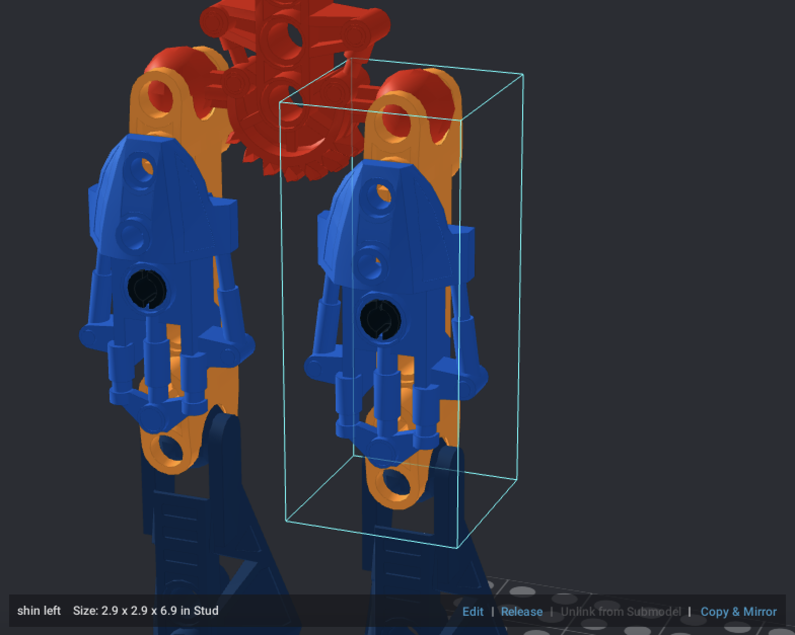
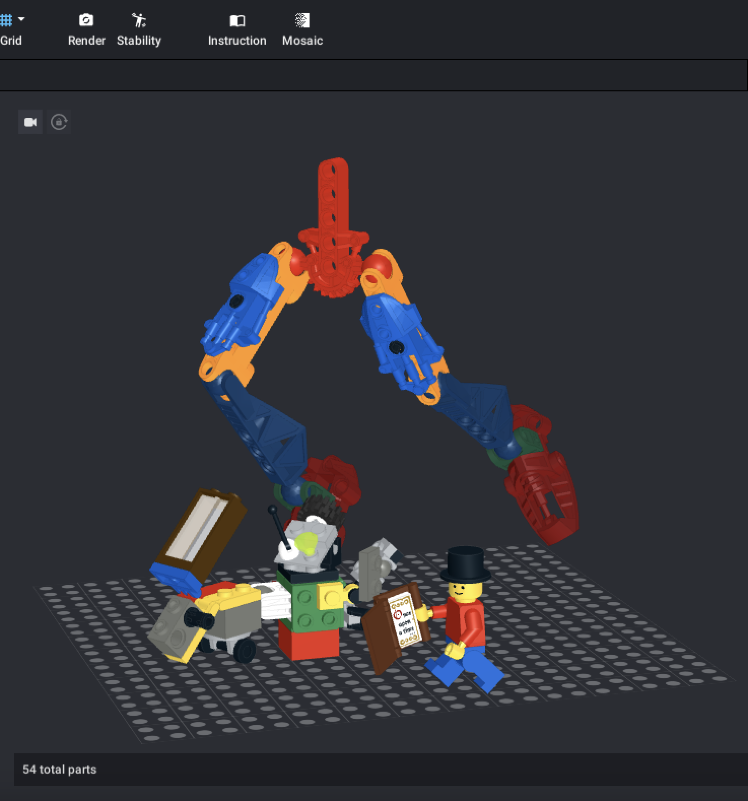
Occasionally, if a model has multiple parts that are all supposed to act as one poseable “unit”, you may choose to submodel them together. This will make posing a lot more direct and simple. To submodel, select all of the parts you want to combine, and click “Create Into Submodel” at the bottom right. See this complex BIONICLE limb setup below:
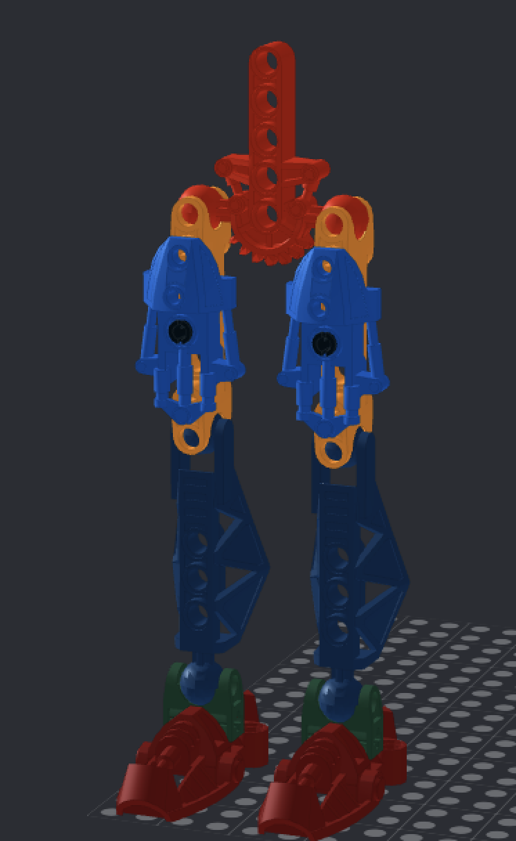
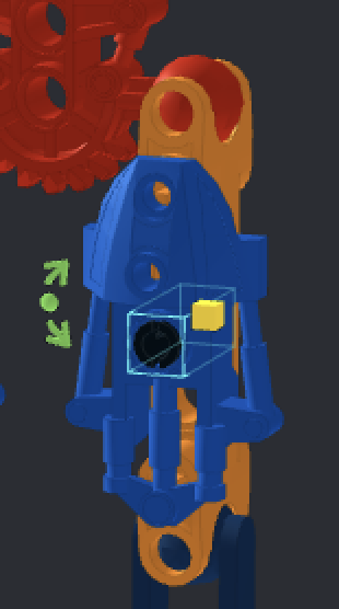
The feet are made up of two pieces each, and the thighs are three pieces each. If you want to move the leg at the hip, you would ordinarily have to select the orange thigh bone to use the Hinge Tool, like so:
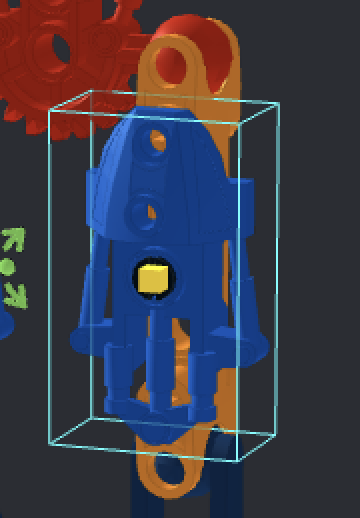
If you were to select the black pin or the blue armor, the hinge points would be wrong. To alleviate this potential frustration, we can submodel all three parts of the shin together.
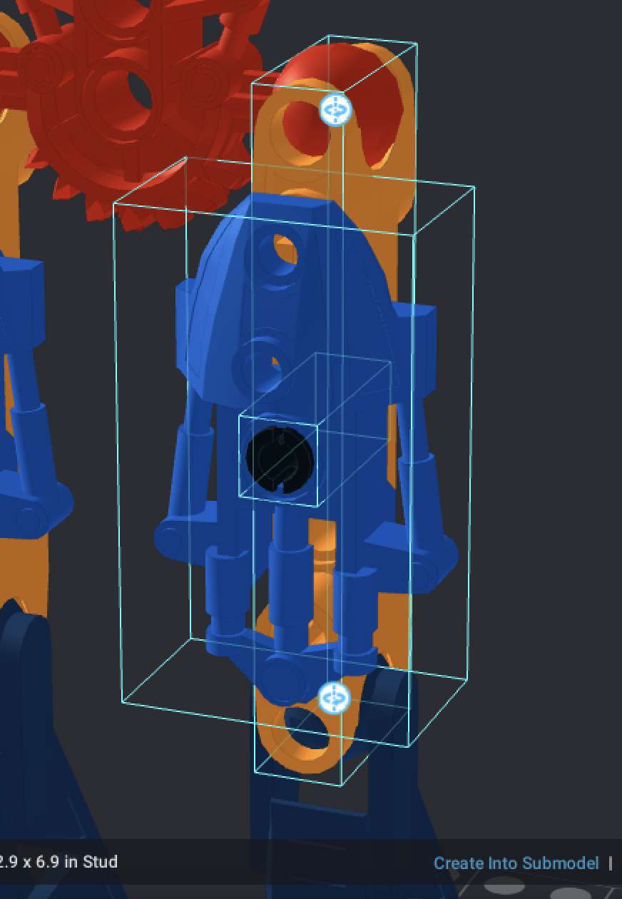
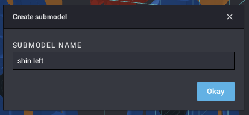
When you click “Create Into Submodel”, a “Create submodel” dialogue will appear. Enter a unique name for your submodel, then click “Okay”.
Now, Studio will treat your submodel like a part with the name you defined. If you wish to alter the build of a submodel, click “Edit”.
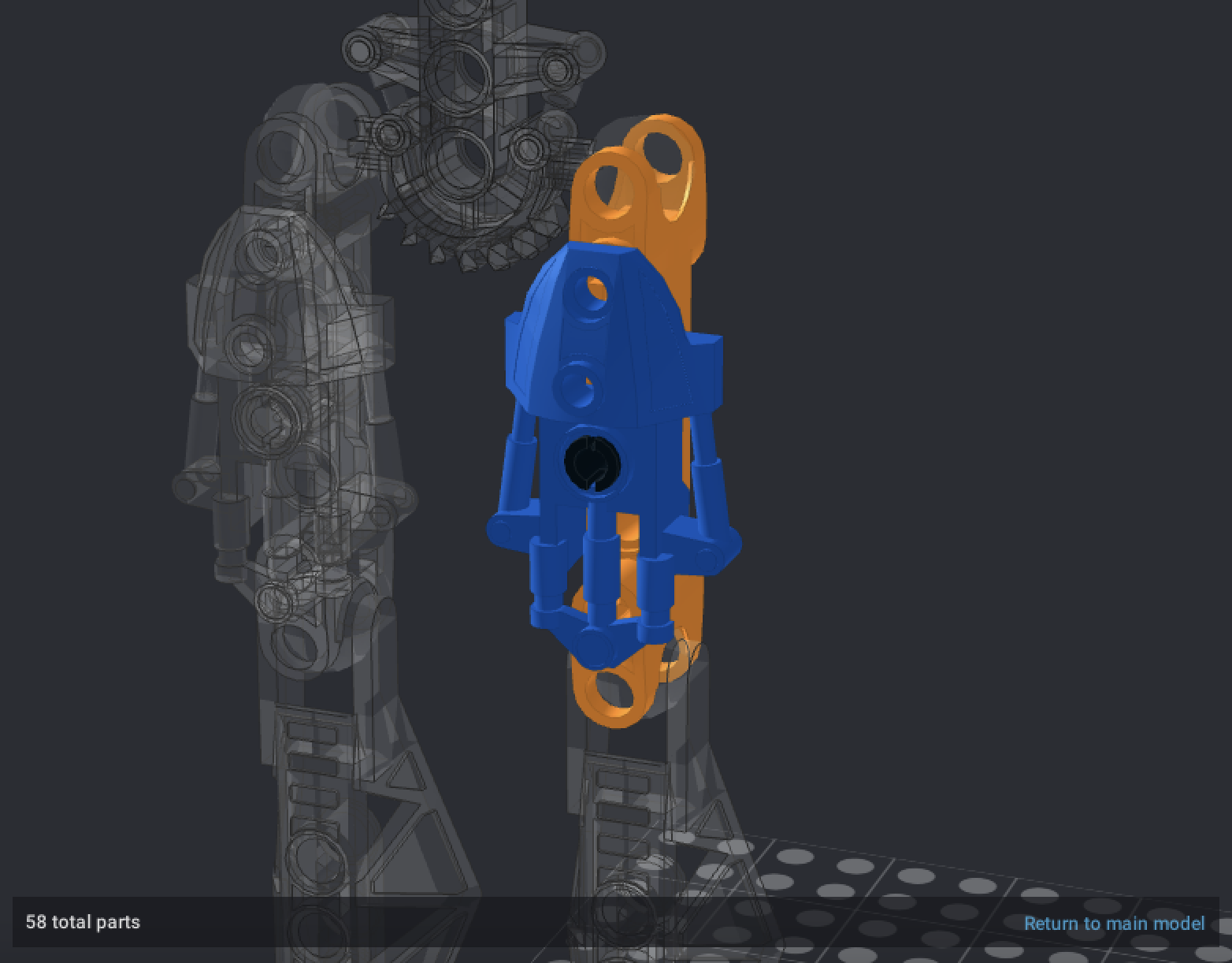
Edit will turn all other parts in the model transparent so you can focus on the submodel. Once you’re satisfied with the changes, you can click “Return to main model”.
“Release” will turn a submodel back into its constituent parts, effectively undoing the submodel.
Step 5: Rendering your model
Once you’ve gotten your model into a pose you’re happy with, click the Render button in the toolbar at the top of the screen.
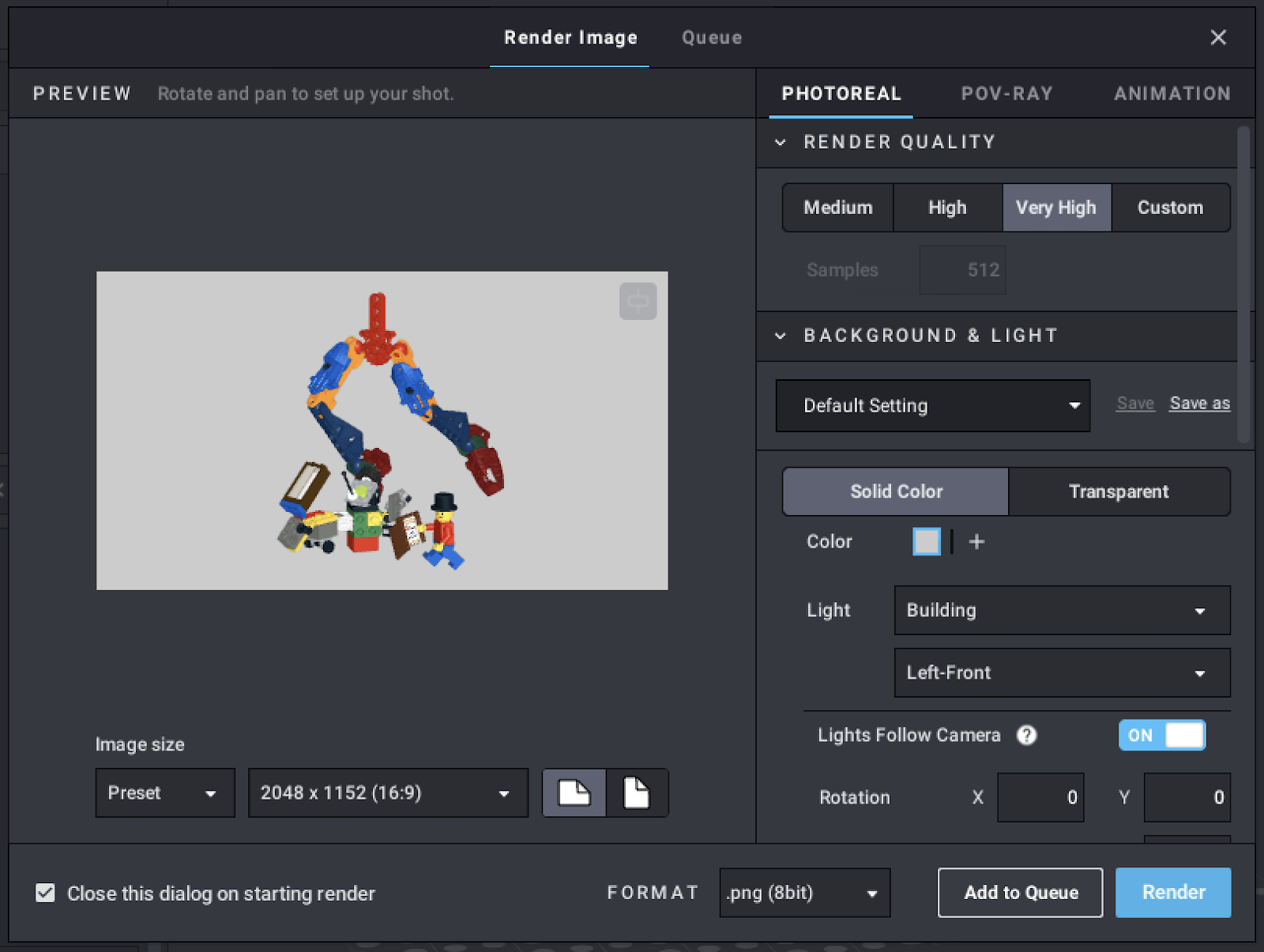
The Render button will bring up the render dialogue. A preview of your render is shown in a frustratingly-small viewport to the left. You can left-click and drag to pan the camera, or right-click and drag to rotate it. The button at the top right of the viewport will attempt to center the camera on your model.
Below the preview, you can choose your image resolution. By default, Studio offers a square 1080×1080 resolution, and multiple 4:3 (fullscreen) and 16:9 (widescreen, the most common desktop background aspect ratio) resolutions. Most modern monitors have a 1920×1080 screen, which is also known as Full HD. 2560×1140 is the Quad HD standard size, and 3840×2160 and 4096×2304 are both different versions of the 4K resolution standard (4K Ultra HD and DCI 4K, respectively). Resolutions below Full HD will lose out significantly on clarity, but will consequently take much longer to render. By switching the image size from Preset to Custom, you can also define your own resolution. Clicking the page button to the right of the render selector will toggle the render orientation between landscape (like a desktop monitor) and portrait (like a smartphone).
On the right, you can choose between the two different render engines Studio has to offer (Animation uses Photoreal). Photoreal, which is a fork of the Cycles renderer in Blender, will generally return superior results to POV-Ray, and as such this tutorial will only focus on Photoreal.
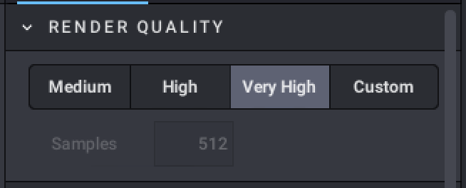
The first parameter that Photoreal uses is Render Quality, which will increase the number of samples. The higher the samples, the better the image will look. Very High is generally a good option that balances clarity with render time.
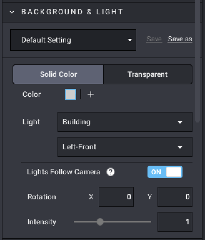
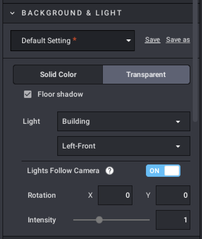
Photoreal’s second parameter is Background & Light.
The topmost drop-down allows you to save multiple background setups to reuse across multiple renders.
Below the setup list is a toggle between a solid-colored background and a transparent background. Transparent backgrounds are good for when you want to place your model in your own background, such as on a mock-up of a set’s box art. When using a transparent background, it’s generally advised to disable floor shadows. When using a solid background, you can choose the color. Click the “+” button to add a new color for your background.
The “Light” drop-down chooses between one of two reflection setups for your model (Building and Mechanic). This tutorial will include examples of both for comparison’s sake. Below that is a drop-down that allows you to choose the lighting origin. This typically works as default, but you can feel free to alter it. The four options are Left-Front, Left-Rear, Right-Front, and Right-Rear. The Lights Follow Camera toggle, when enabled, will override the chosen lighting source direction and instead attempt to keep the entire model well-lit. The Rotation values will also define the lighting source direction.
The Intensity slider will determine how bright the natural lighting of the render is. With Intensity set to 0, there will be no natural lighting, and all lighting will come from emissive colors put on your model. Intensity can be increased past 1 (to a maximum of 3), but this will result in a washed-out render.
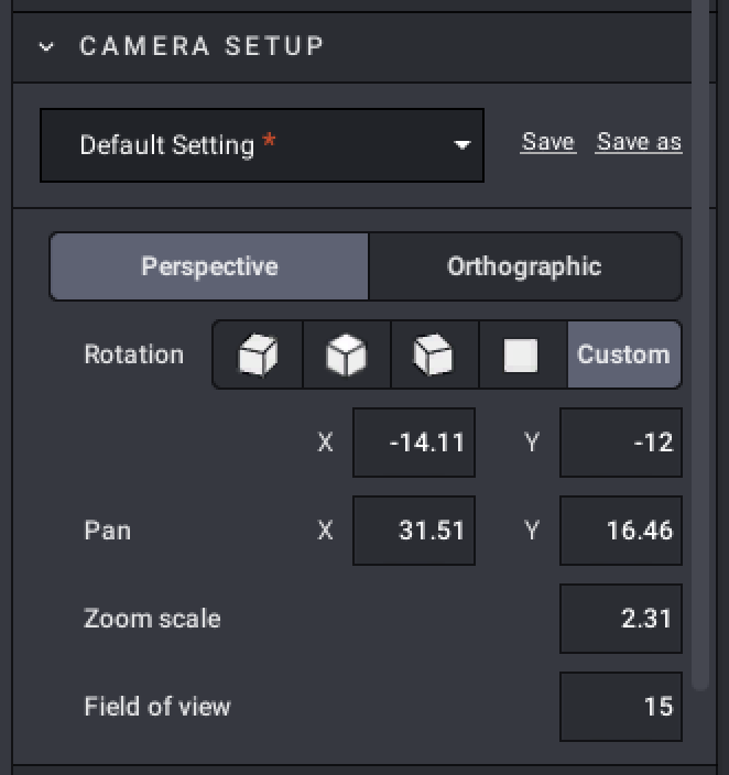
Photoreal’s third parameter is Camera Setup.
As with Background & Light, you can save camera setups for use across multiple renders.
The two projection modes are Perspective and Orthographic. In Perspective mode, objects that are further from the camera will appear smaller. This is good for dynamic poses and action shots. In Orthographic mode, all objects will be the same relative size, no matter their distance from the camera.
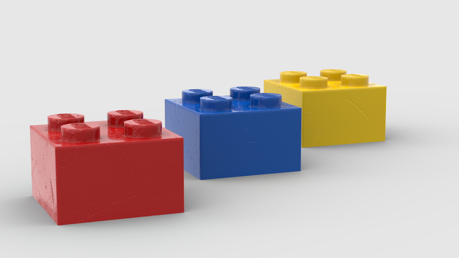
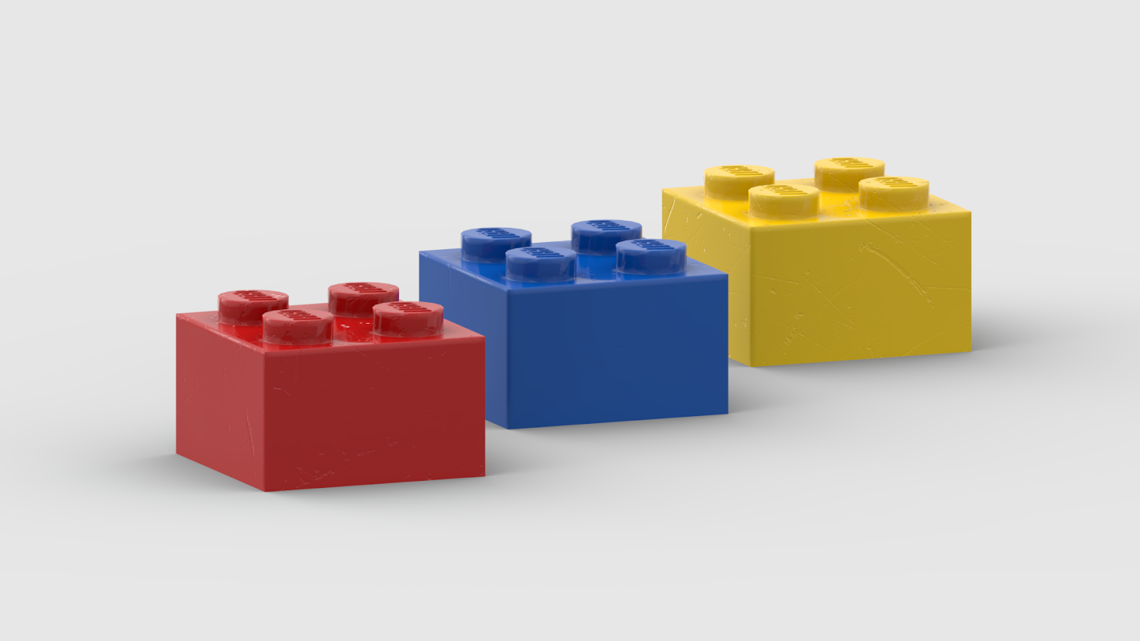
At left, a Perspective render with a 15 degree field of view. At right, the same camera setup in Orthographic mode. Notice that in the Perspective setup, the yellow brick is smaller than the red brick; in the Orthographic setup, they are the same size and evenly spaced.
The Rotation options will rotate the camera. Typically, you want to use your own rotation setup. After positioning your camera how you like with the viewport, you can fine-tune the rotation with the X and Y values below the Rotation selector (when Custom is selected).
You can also fine-tune the panning of the camera with the Pan values.
Zoom scale determines how zoomed-in the camera is.
The Field of view value determines the wideness of the angle of view the camera takes. The higher the value, the wider the view, and the more objects are visible at the periphery. The trade-off of a high field of view is that objects close to the edges of the field of view or close to the camera will be warped (meaning shots from further away will look better). Studio uses a very low default field of view of 15, which does not lend itself well to dynamic shots. Increasing the field of view to 45 will produce more dynamic results for action shots. In Orthographic projection mode, field of view is disabled.
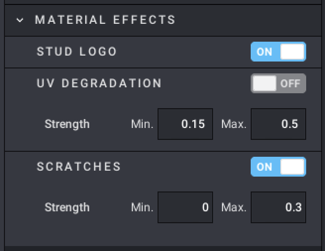
Photoreal’s fourth and final parameter is Material Effects. These control elements that affect the realism of your renders.
The Stud Logo toggle controls whether the LEGO logo will appear molded on studs.
The UV Degradation toggle controls the yellowing of colors as if due to age. The strength values control how noticeable the effect is.
The Scratches toggle adds cosmetic scratches to the parts to simulate playwear. The strength values control how noticeable the effect is.
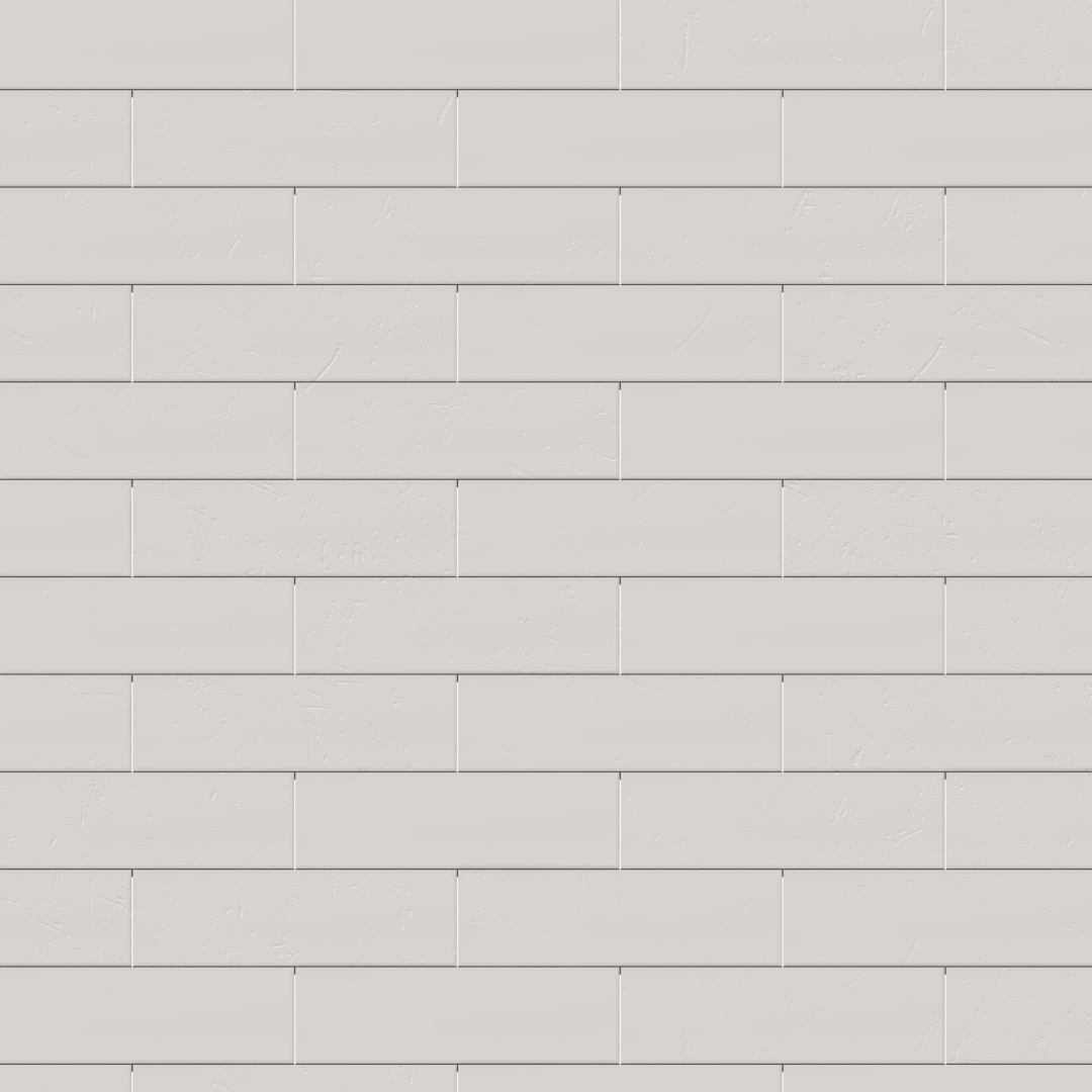
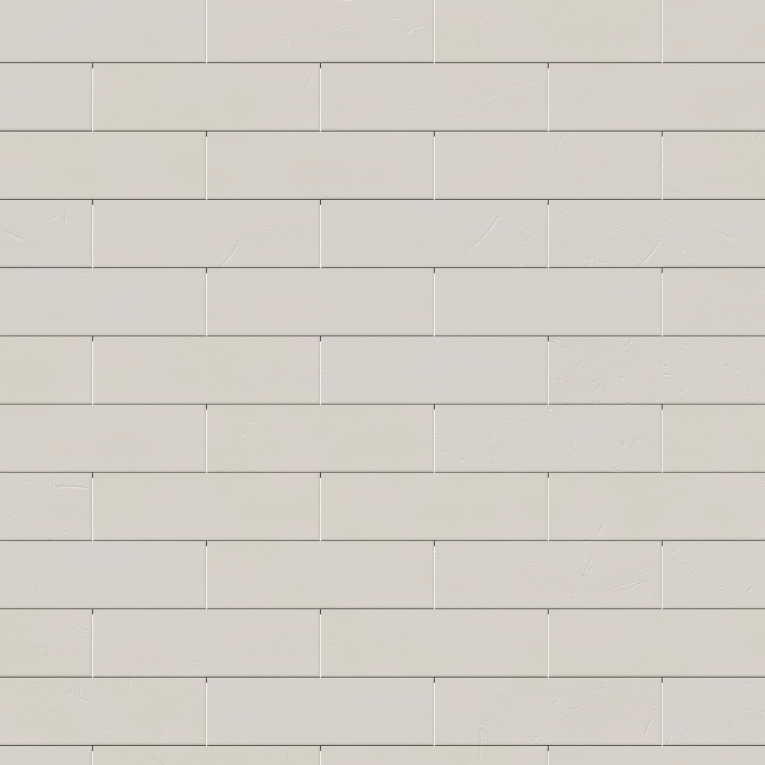
These two renders are of the same setup, but the right image has had UV degradation enabled (with the default strength values). The white bricks are noticeably yellower, and the degree of yellowing is slightly randomized.
At the bottom of the Render dialogue, you can choose the output format, with the options being 8-bit PNG, 16-bit PNG, JPG, and BMP. PNG is a compressed and lossless format, which means it will not feature lossy compression artifacts like JPG files. 16-bit PNG features a wider range of available colors to display. JPG is a lossy, compressed format, which means it will produce smaller files than PNG, but they may feature unwanted compression artifacts. BMP files are completely uncompressed and lossless, but will produce the largest files.
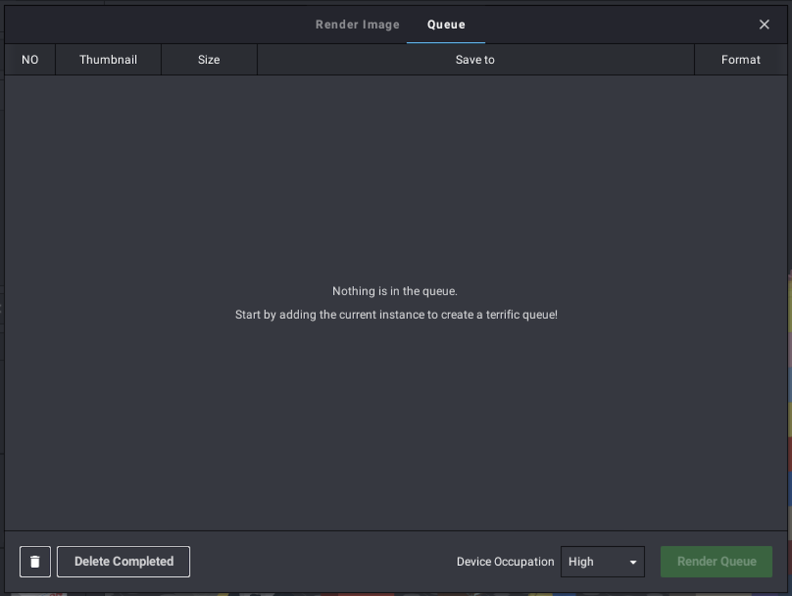
If you want to render multiple setups at a time, you can press the “Add to Queue” button to save your render setup to the Queue. With the Queue, you can save multiple setups and set them all to render sequentially rather than setting up a new render each time the previous render completes. Typically, because the render preview is not also being rendered to your computer screen, images put in the Queue will render faster than if they were rendered on their own.
Otherwise, once you’re ready, you can press “Render” to render an image of your model. After giving it a filename, the file will export, and Eyesight will open in another window to show you the render progress.
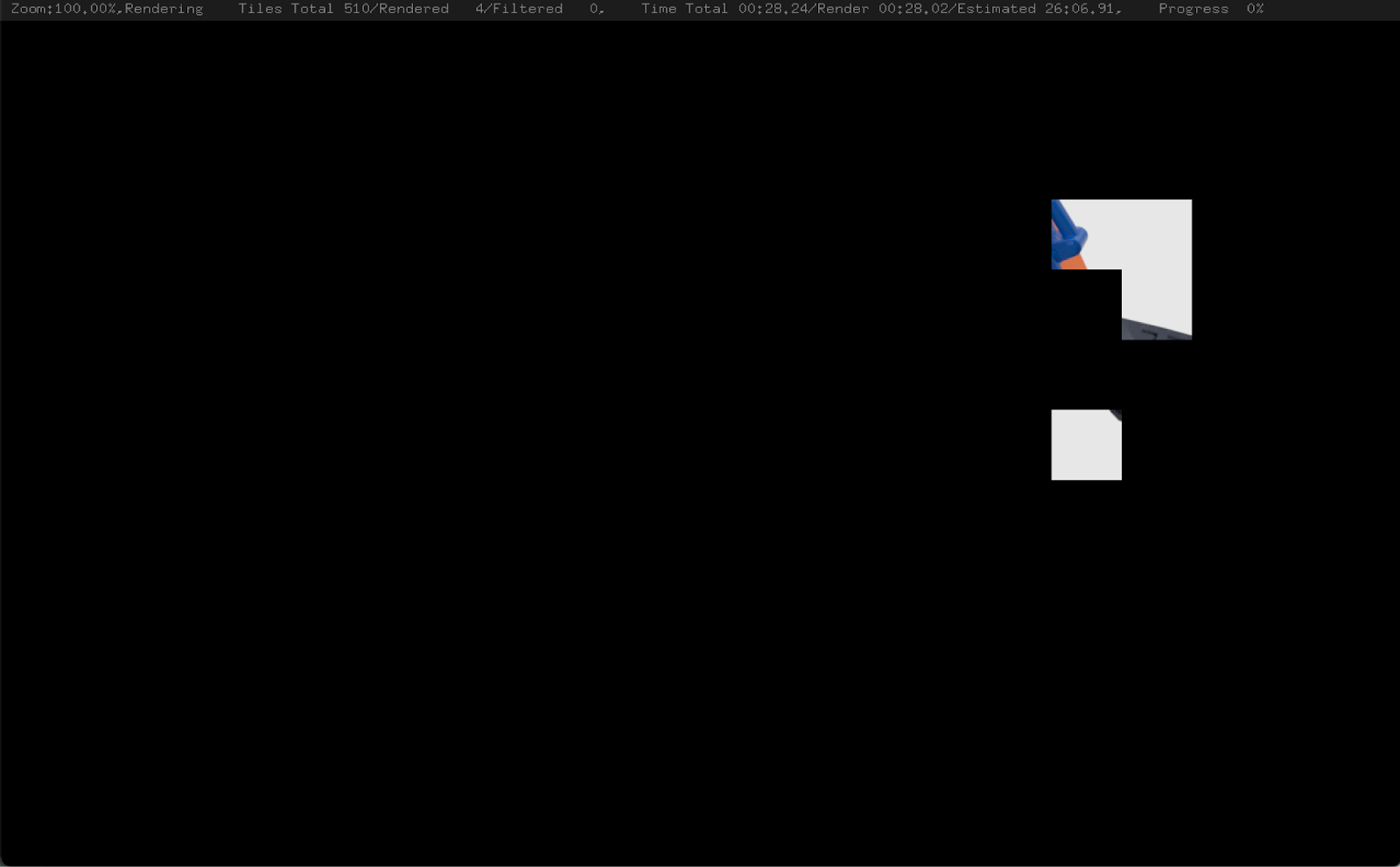
Across the top is shown information on the progress of the render, including the amount of tiles in the render and how many have been completed, the elapsed time and the estimated time until completion, and total progress as a percentage. The screen starts out black and slowly becomes filled with the rendered image as the render progresses.
Please note that if you close Studio at any time during the render process, the renderer will terminate.
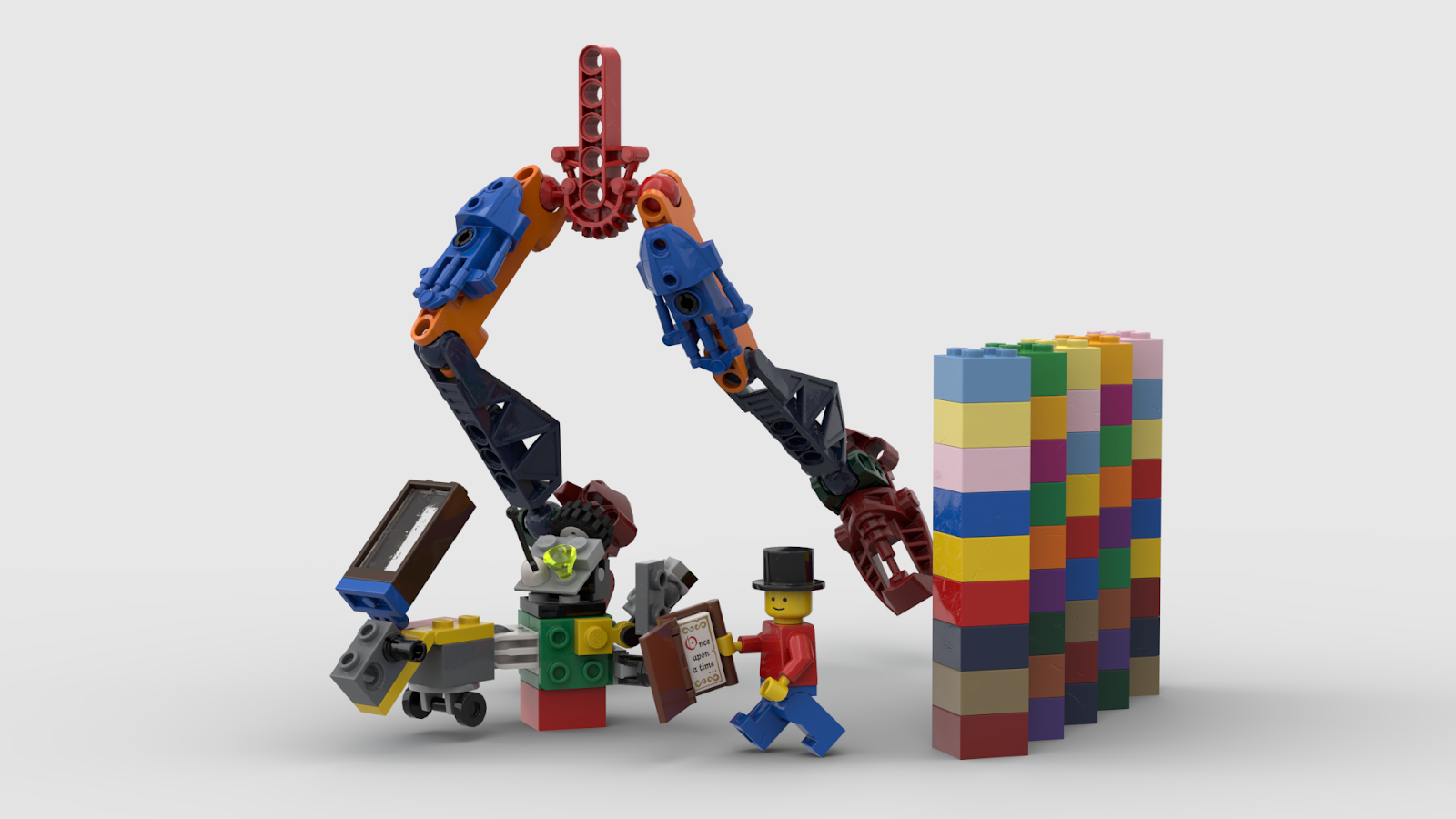
Here is the result of my demonstration render. Note that in renders with a floor shadow, the floor is calculated as being directly below the lowest part in the model.
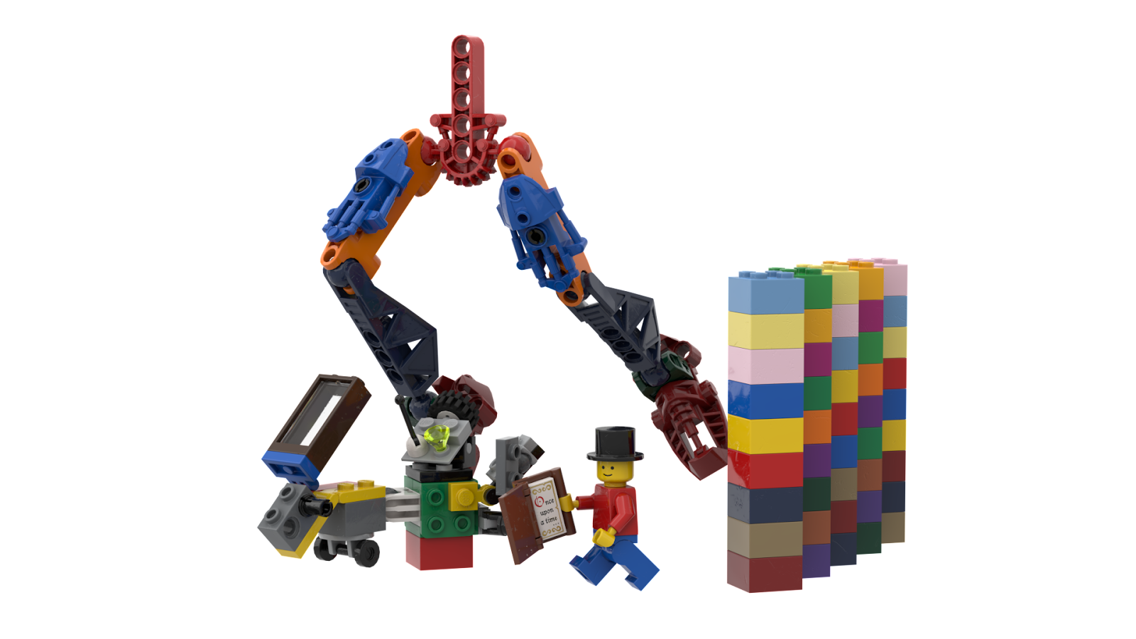
Here is the same render with a transparent background. Transparent-background renders typically take less time than ones with colored backgrounds.
Step 5a: Lighting setup with emissive colors
Studio comes pre-packaged with a set of emissive colors, called “Luminous” and “Luminous Soft” (“emissive” refers to a texture that emits light onto its surroundings). These can be used to create lighting setups around your model for renders. By turning the Intensity of a render to 0 and adding a part (such as a large plate) in a Luminous color, you can create a sort of “spotlight” for your render. Renders lit in this way tend to look better than the diffuse-lit Intensity 1 renders.
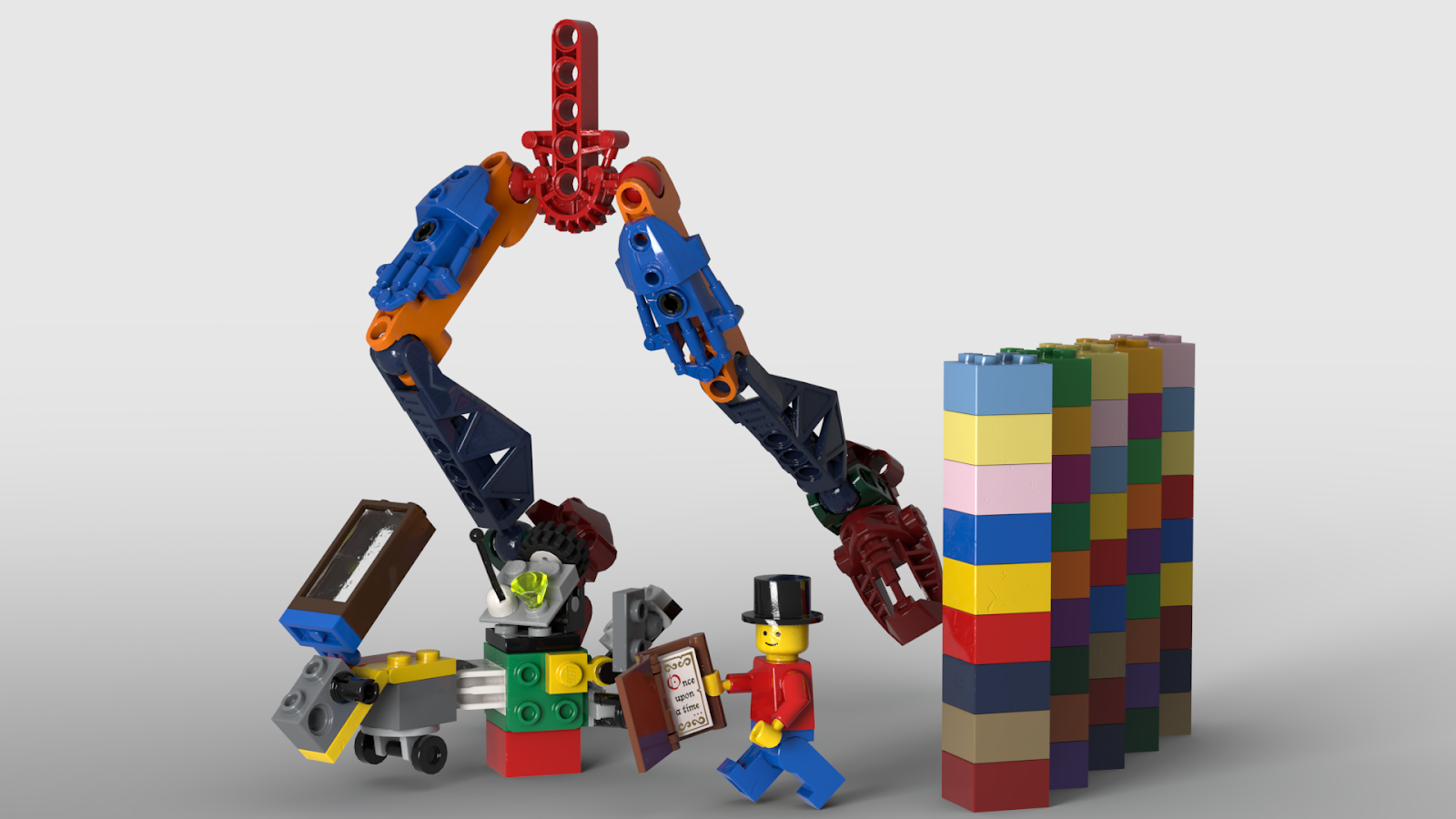
In this render, I’ve added a 16×16 plate (91405) in the color Luminous White to the setup off-camera. The larger the part, the more light it will emit.
Custom color packs will typically include their own custom emissive colors. Try experimenting with other light colors and intensities, and different spotlight parts to achieve differing effects!
Step 6: Installing custom parts
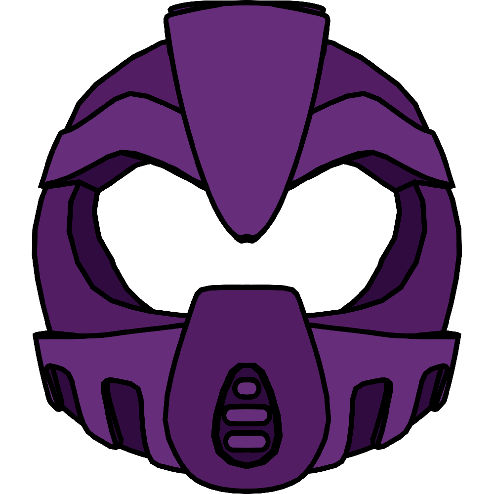
Studio is a wildly popular tool for digital MOC’ing in the BIONICLE community. Unfortunately for us, a wide range of BIONICLE parts are unavailable in Studio. Studio’s developers foresaw this shortcoming and allowed users to install their own custom parts. Custom parts can not only represent official LEGO pieces not yet added to the program, but can be LEGO-compatible parts (popular in the BIONICLE community is custom masks for their MOCs) or even non-LEGO objects entirely (such as a lightbox and spotlights for posing MOCs on).
The first step to installing custom parts is downloading them. An extensive list of custom parts packs for BIONICLE MOCists can be found on vootcaboot.gay.
Once you’ve downloaded a custom parts pack, you can extract the folder. The actual parts will be contained across three folders: “parts”, “collider”, and “connectivity”. The “parts” folder contains the model data of each part as a DAT file named for the part ID. The “collider” folder contains the collision data of each part as a CONN file named for the part ID. This is used by the Collision Tool to calculate when parts are colliding. The “connectivity” folder contains the connectivity data of each part as a COL file named for the part ID. This is what allows Studio to connect parts together.
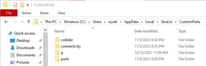
To install a custom parts pack on Windows, open File Explorer and navigate to C:\Users\[your username]\AppData\Local\Stud.io\CustomParts. AppData is a hidden folder, so be sure to enable those in File Explorer.
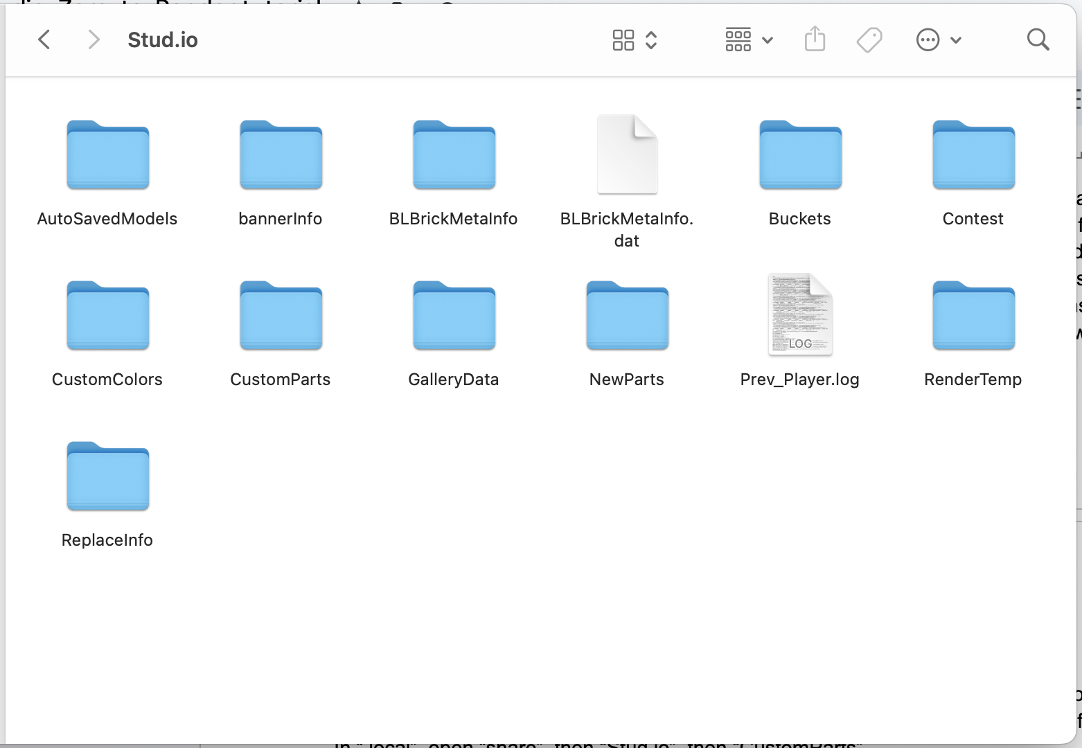
To install a custom parts pack on MacOS, open Finder. Press Shift+Command+G to call up the Go dialogue. Type “/Users/[your username]/.local” (be sure to include the period before “local”). In “.local”, open “share”, then “Stud.io”, then “CustomParts”. If the CustomParts folder does not exist, create it!
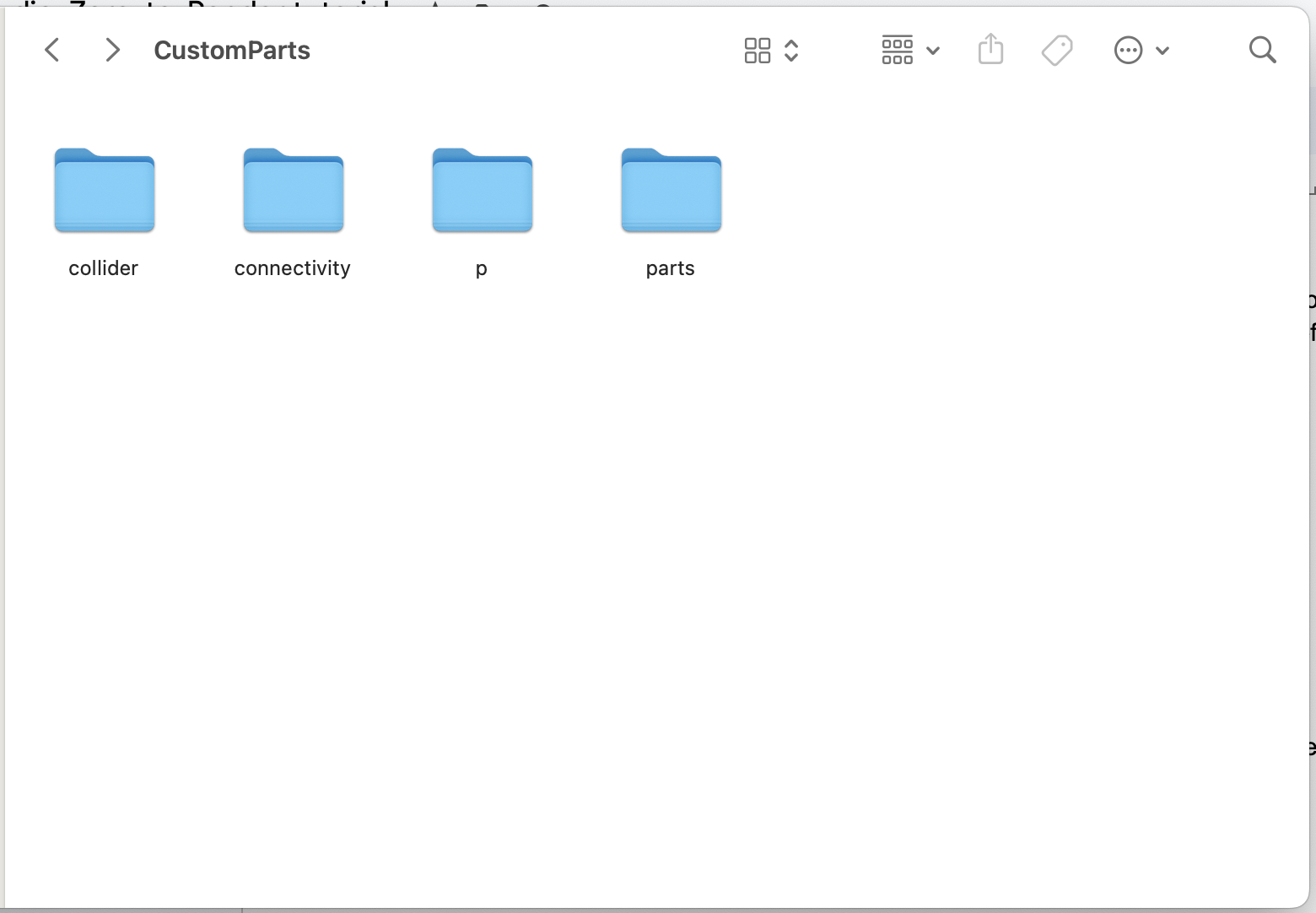
This is the custom parts directory, where Studio’s “parts”, “connectivity”, and “collider” folders can be found. If you had to create the CustomParts folder, you can create the folders it contains as well. (Note: if these folders already exist but the “p” folder is not present, you can create it as well. Some custom parts packs make use of the “p” folder.)
Now, to install your custom parts, drag the contents of the pack’s “parts” folder into Studio’s “parts” folder. Repeat for the “collider” and “connectivity” folders.
Once you’ve installed the custom parts, return to Studio.
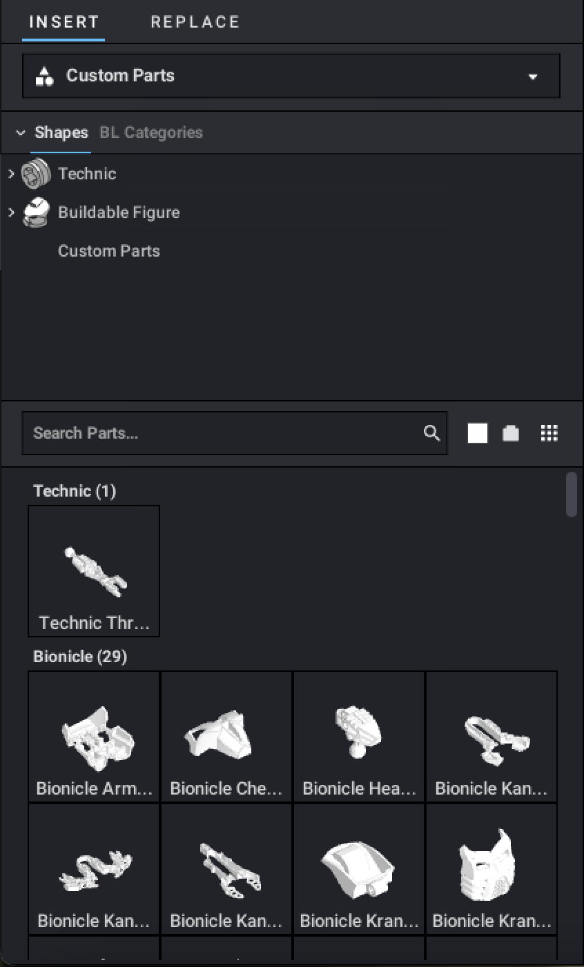
Just above the category selector is a drop-down menu that says “Main”. This is the palette selector. Click it to open it, and select the Custom Parts palette to view your custom parts.
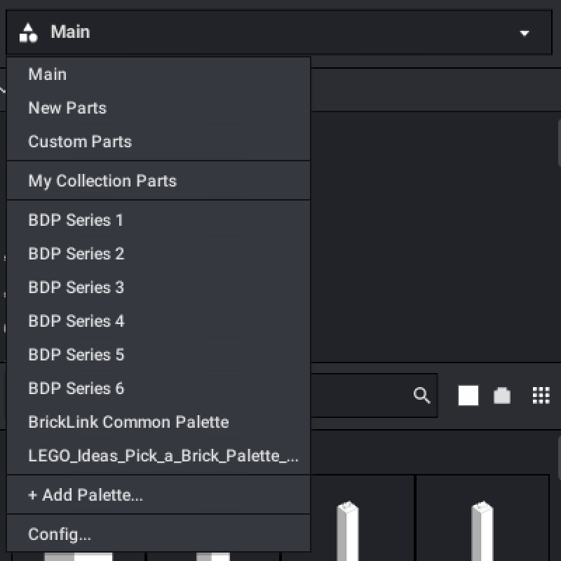
To return to the Main palette again, open the palette selector drop-down and click “Main”.
Step 6: Installing custom colors
Similar to its capacity for custom parts, Studio can be extended with custom colors. However, unlike with custom parts, custom colors are not easy to install. Warning: performing this process incorrectly can damage your Studio installation. If at any point you need assistance, join the Vootcaboot.gay Discord server and ask for help. DO NOT attempt to diagnose and solve issues on your own.
To install a custom colorpack on Windows, open File Explorer and navigate to C:\ProgramData\Studio\CustomColors (the Big Community Colorpack authored by me has a file shortcut to jump here instantly). ProgramData is a hidden folder, so be sure to enable those in FileExplorer.
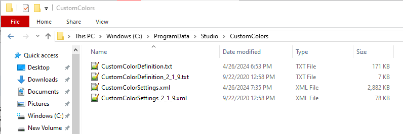
It is important that you perform the following steps in this directory and no others. For reasons unknown, Studio keeps copies of the CustomColorDefinition.txt and CustomColorSettings.xml in at least two directories. You should only modify the files in ProgramData.
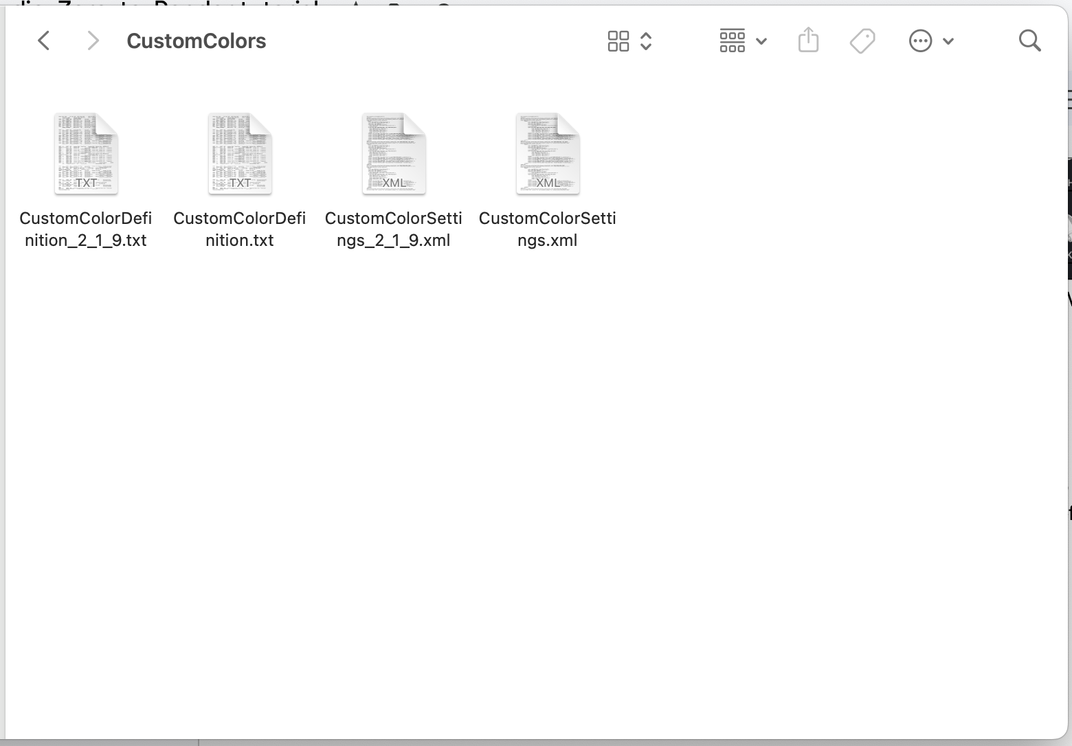
To install a custom colorpack on MacOS, open Finder. Press Shift+Command+G to call up the Go dialogue. Type “/Users/[your username]/.local” (be sure to include the period before “local”). In “.local”, open “share”, then “Stud.io”, then “CustomColors”.
Every colorpack includes a “CustomColorDefinition.txt” and a “CustomColorSettings.xml”. To install a colorpack, open the CustomColorDefinition.txt found inside and copy everything. Then, in Studio’s CustomColorDefinition.txt, scroll to the bottom, and paste the contents of the custom colorpack’s CustomColorDefinition.txt.
It is extremely important that this step is done right. Open the CustomColorSettings.xml found in the custom colorpack. If it begins with <eyesight>, copy everything after the <eyesight>. If it does not begin with <eyesight>, copy everything. If it ends with </eyesight>, do not copy that. Then, in Studio’s CustomColorSettings.xml, scroll to the bottom, and, before the </eyesight>, paste the contents of the custom colorpack’s CustomColorSettings.xml. STOP! Is the final line in CustomColorSettings.xml </eyesight> AND ONLY </eyesight>? If not, DO NOT CONTINUE. Join the Vootcaboot.gay Discord server and ask for help.
Now, if Studio was open, restart it. Then, check your color browser.
STOP! Are all the colors available in the color browser? If not, DO NOT CONTINUE. Join the Vootcaboot.gay Discord server and ask for help.
Now, try a render with one of the custom colors you’ve installed. If the render succeeds, you have successfully installed a custom colorpack. If the render fails, STOP. DO NOT CONTINUE. Join the Vootcaboot.gay Discord server and ask for help.
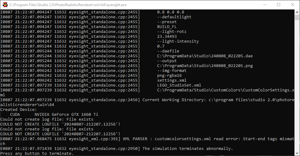
This is an example of a render failure – note “The simulation terminates abnormally.” The error code on the line above can vary. (Note the Eyesight log only opens on Windows.)
Step 6a: Technical explanation of colorpack installation
Studio’s Eyesight or Photoreal rendering engine is a fork of the Cycles renderer included as part of 3D modelling and animation software Blender. One of Cycles’s UI elements is the “node” system, where different aspects of a model, such as its surface texture, subsurface light scattering, reflectivity, metallic effects, etc. are controlled by individual nodes, which can be connected and organized in a visual manner. Studio throws out the visual aspect and reduces nodes down to its barest code, which takes the form of nested tags in an XML file.
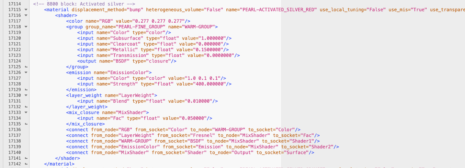
Similar to HTML, tags need to be opened and closed (although some tags can be formatted <tag class=”info” /> to save space, especially when they denote a single action that doesn’t contain anything, such as the <connect> and <input> tags in the image above). It is because of this that the paste location of an installed colorpack is important.
HTML documents, such as web pages, must start with an <html> tag to signal the beginning of HTML code, and they must end with an </html> tag to signal the end of HTML code. Similarly, to signal the beginning of XML code for Eyesight to interpret, the CustomColorSettings.xml file must start with an <eyesight> tag, and it must end with an </eyesight> tag to signal the end of XML code. If the Cycles renderer encounters something unexpected, such as extra <eyesight> tags or unclosed tags, it may fail and end the process without completing the render. Similarly, if a colorpack is installed after the </eyesight> tag, the renderer will not be able to utilize it, because the code will have already ended. (In this case, Eyesight will use a “fallback” shader, which is when it uses the hex code defined in CustomColorDefinition.txt as the base color for the render.) Most of the time, if Eyesight encounters something unexpected in CustomColorSettings.xml, it will simply crash out and not allow any renders to be completed. This is why it is vitally necessary to install colorpacks correctly, and to seek out help if you encounter issues. As you might be able to see in the screenshot above, Eyesight code is nearly inscrutable and not in any way intuitive.
As a further complication to colorpack installation, Studio has its own quirks and instabilities to its color system. Every color is categorized into a Category Nickname, which is a colorpack-author-defined group for related colors. For example, all of the colors that originate in pride flag designs in the Big Community Colorpack belong to the Category Nickname “Pride Flag Colors”. You can see this in Studio:
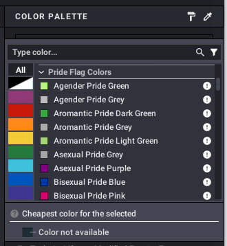
One of Studio’s bugs is that if a Category Nickname is too widely used, the color browser will break and not show all colors in the list.
Another definable parameter of Studio’s colors is the Category Name. Whereas the Category Nickname is freely definable, there are only a few options for Category Name because they define the color’s behavior in Studio. Category Names include Solid Colors, Transparent Colors, Pearl Colors, Metallic Colors, Rubber Colors, Satin Colors, Chrome Colors, Glitter Colors, and Speckle Colors. Here are examples of how they behave in Studio:
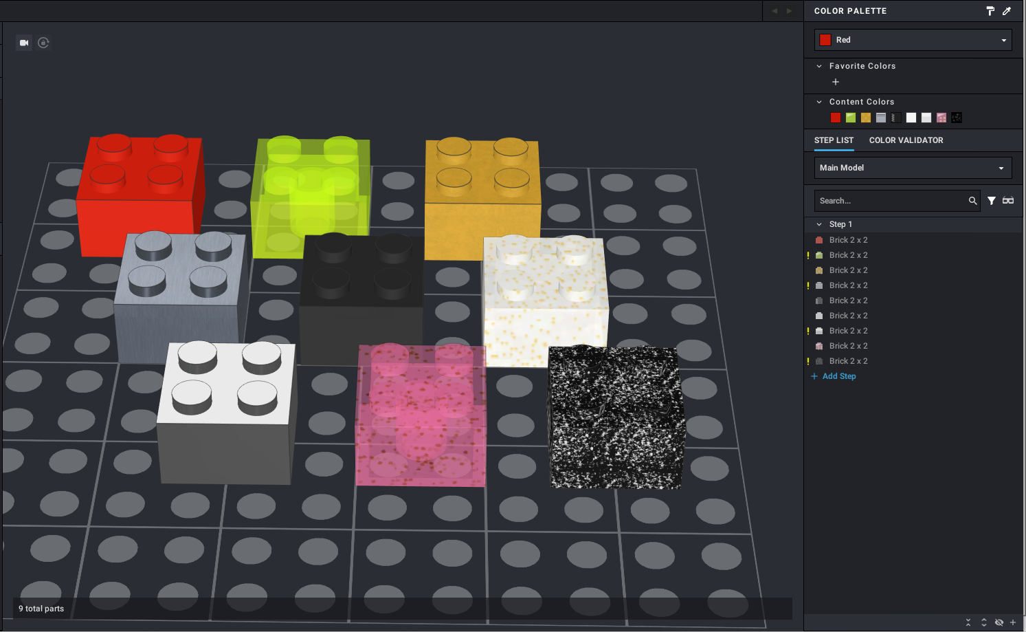
From left to right and top to bottom, these colors are Red (a Solid Color), Trans-Neon Green, Pearl Gold, Metallic Silver, Rubber Black, Satin Trans-Clear (Satin is the term for “iridescent” or “opalescent” coated parts), Chrome Silver, Glitter Trans-Dark Pink, and Speckle Black-Silver (the color used for the 2005-2008 Castle themes’ metallic colors). Each one has a unique behavior both in the viewport and in the color list to visually distinguish them.
One of Studio’s bugs is that if different colors under the same Category Nickname use different Category Names, then it will only show one of the Category Names in the browser and hide the rest. For example, if I defined a new Category Nickname with both Solid Colors and Transparent Colors, Studio would only show either the Solid Colors or the Transparent Colors and the other would be unavailable.
For these reasons, it is imperative that a custom colorpack’s CustomColorDefinition.txt is well-written and uses diverse Category Nicknames.
Leave a Reply